Wednesday, August 19, 2020

15 Best Practices for Responsible Responsive Web Design 2021

15 Best Practices for Responsible Responsive Web Design 2021


Responsive web design is not just a matter of squeezing and stretching.

It’s about delivering one website countless ways depending on the width of the screen.

What to add? What to remove? How to prioritize what’s most important? What are the implications for search rankings? And how do you do all of that with just one code base?

It truly takes an expert to responsively code a website.

So we asked Tim Cross, one of AwesomeWeb’s finest responsive web designers, to give you insight on what it takes to build a proper, responsible, and responsive website.

Whether you hire Tim or decide to add responsiveness to your website yourself, keep this as a resource to know what needs to be done.

1. Hidden navigation menus.

On smaller screens hiding the main navigation menu is a good way of keeping layouts simple. An icon, text or combination of both indicates to the user where the menu is.

Your options include a simple drop down menu where the menu slides down and covers the main content below or the overlay method where the menu expands and covers the whole screen.

hidden-navigation-responsive-web-design
BBC Sport uses a drop down menu that expands when pressed. As they have multiple collapsed menus on the same page, they use different calls to action to help the user understand the hierarchy of the page.

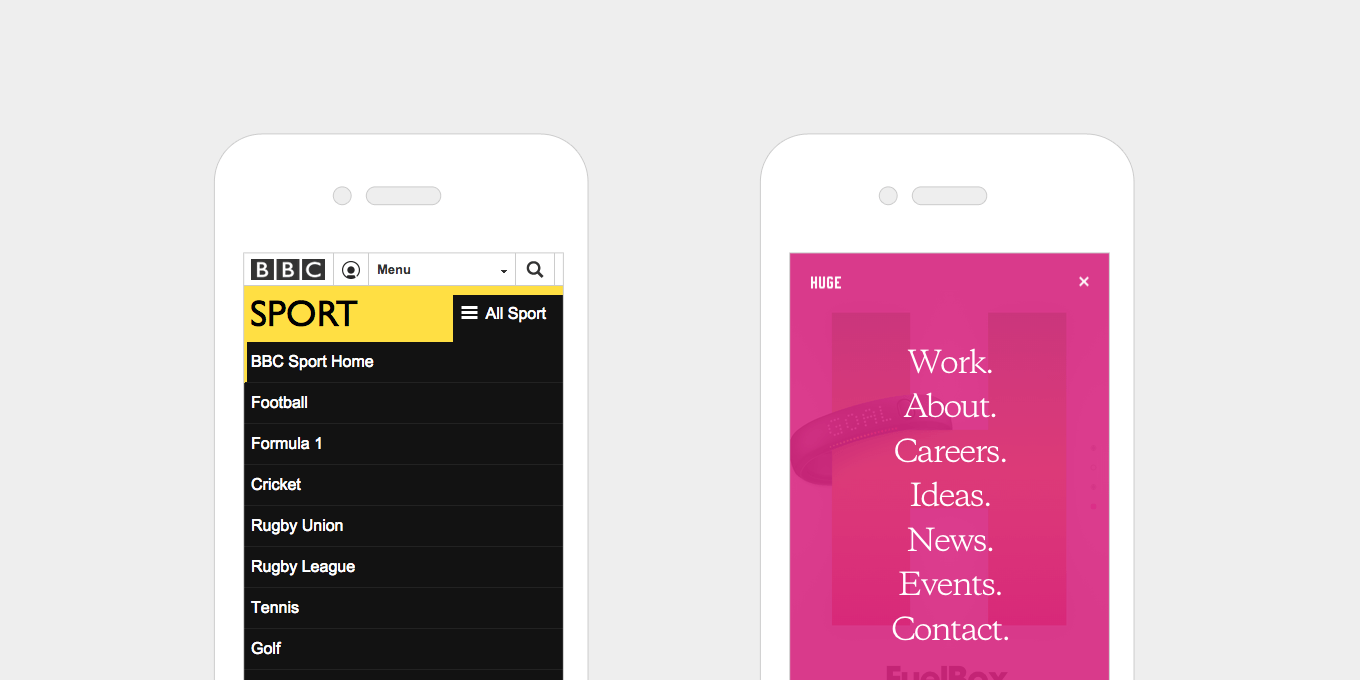
Huge uses an overlay menu. They also use this menu style on the desktop view, keeping the burger icon visible and simplifying the content on the page.

Top Tip for newbie bloggers:

Invest in a premium theme that presents your brand in the best possible light.

Free themes are great for starting out but most cannot be properly customized. Remember that saying: First impressions count!

2. Horizontal swipeable menus.

Another way to show menus on smaller screens is to keep it visible but let the content overflow off the edge of the screen. Showing part of the text cut off indicates that they can swipe to reveal.

horizontal-swipeable-menus-responsive-web-design

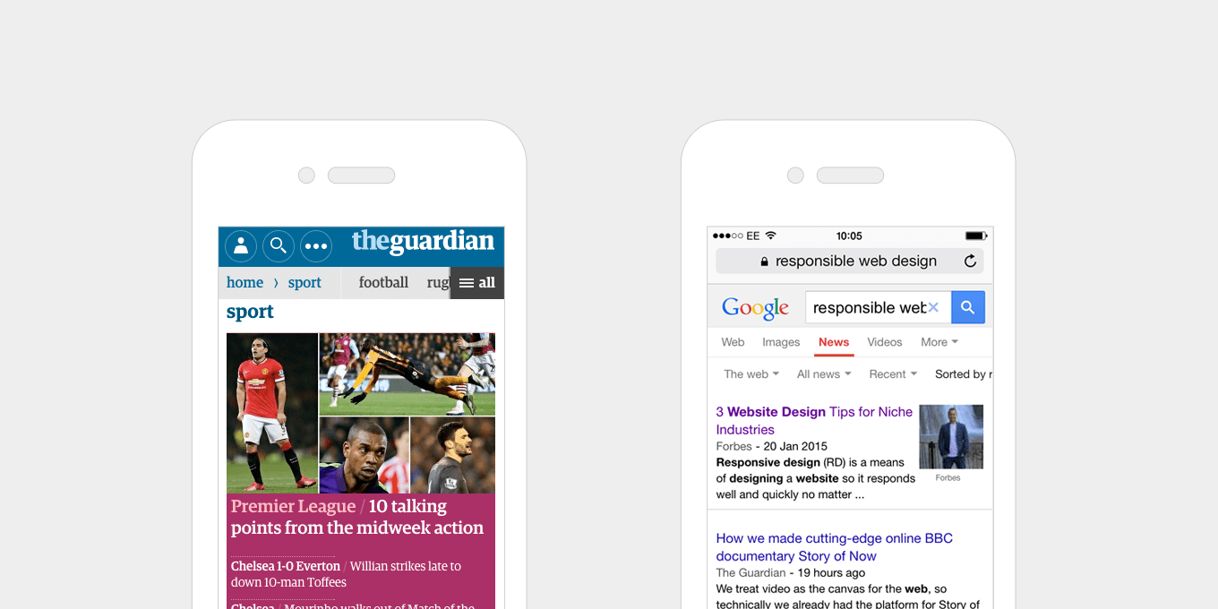
The Guardian uses a clear, horizontal scroll menu, with an extra call to action to see “All” – this appears as a drop down menu when pressed. A good example of applying different methods in the space available.

The horizontal scroll menu on Google is a list of plain text links, that overflow off the edge of the screen – a simple way of indicating more content to the user. Each text link has drop down menu that appears when pressed.

3. Give buttons and links large, clickable areas.

Rather than making buttons smaller on mobile, make them larger, so that they are easier to tap. In fact this doesn’t just apply to small screens, it’s good for them to be large whatever the device – from touch screen tablets to desktop PCs.

Large buttons improve usability. As well as making buttons larger, text links benefit from being larger. If, for example, you have a grid of news headlines, with a text link that says “Read More” inside each of them, rather than making this the link, make the whole content block a link, so that the user can click anywhere.

Easier to use. Better experience for all.

buttons-responsive-web-design

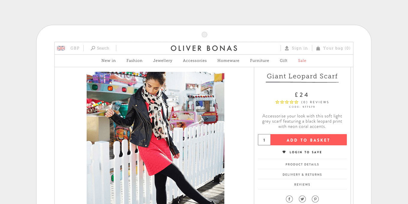
The Add to Basket button on the Oliver Bonas site is large, clear and stands out from the page with it’s contrasting colour.

large-buttons-responsive-web-design

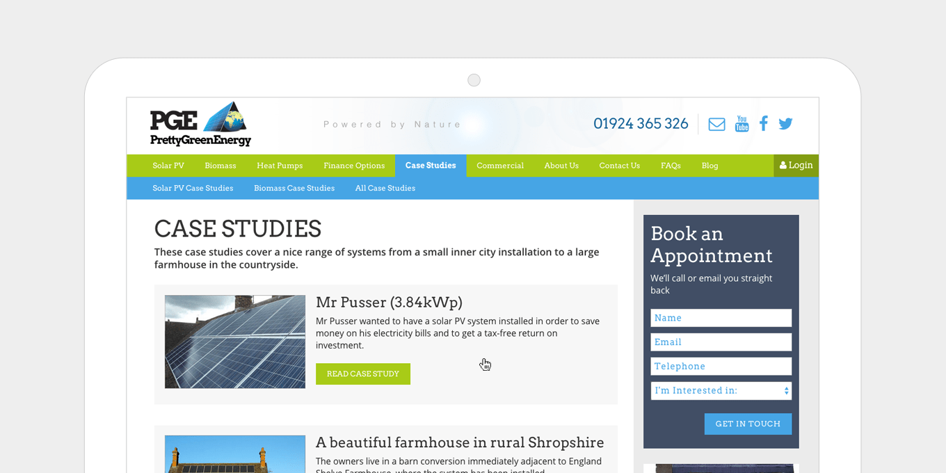
The Pretty Green Energy site has big buttons, and large, clickable areas on content list items.

4. Balance font weights and sizes.

The size ratio between headers and paragraph text should be well balanced. Large headers don’t look good on mobile, especially if they stretch over a few lines. Everything should be resized appropriately.

Newer mobile devices have high-resolution screens, which makes text more legible and easier to read. You can afford to go a little bit smaller on mobile screens and increase the font sizes when you get to a larger display.

font-responsive-web-design

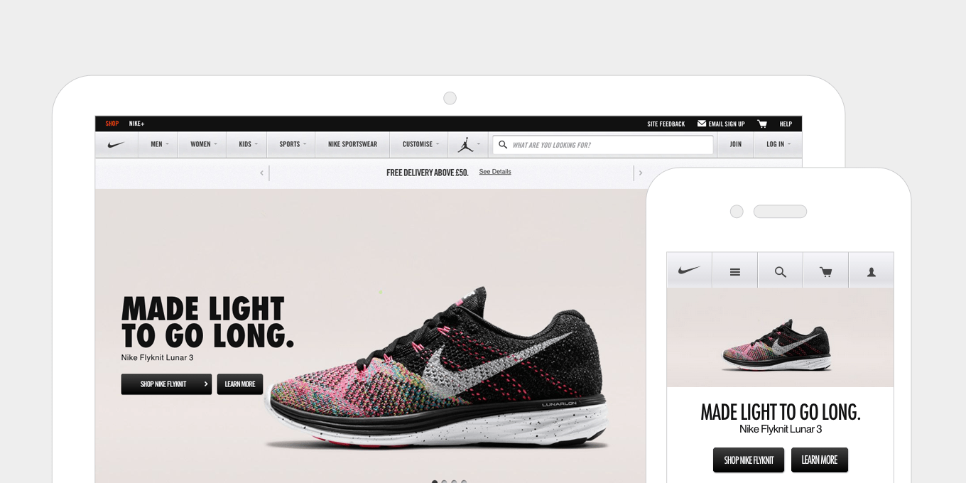
Nike use a chunkier weight of font on desktop, which works well in the banner. On mobile they lighten the font and reduce the size so that it fits on one line.

font-balance-responsive-web-design

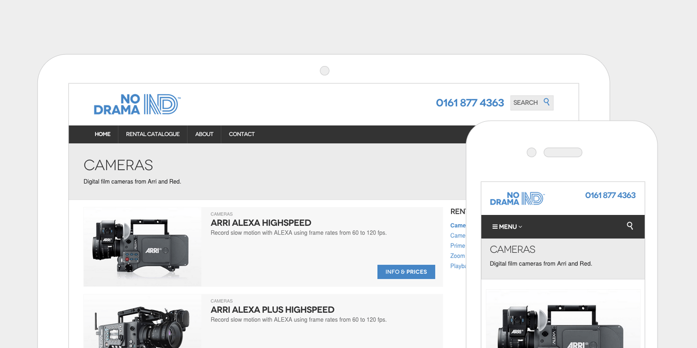
No Drama reduces it’s H1 titles on mobile so that they fit on the screen and don’t over power the page.

5. Optimal reading widths.

While making a layout wider on larger screens, it is important to consider the line lengths of your content.

If a line of text is too long it’s harder to read because it’s difficult to follow line-to-line. Similarly, having lines that are too short breaks the rhythm of reading as the eyes have to move back-and-forth too often.

Common practise is to keep line lengths at about 60-75 characters. This can be achieved by setting your text areas to have a max-width of approximately 500/700 pixels wide.

optimal-reading-responsive-web-design

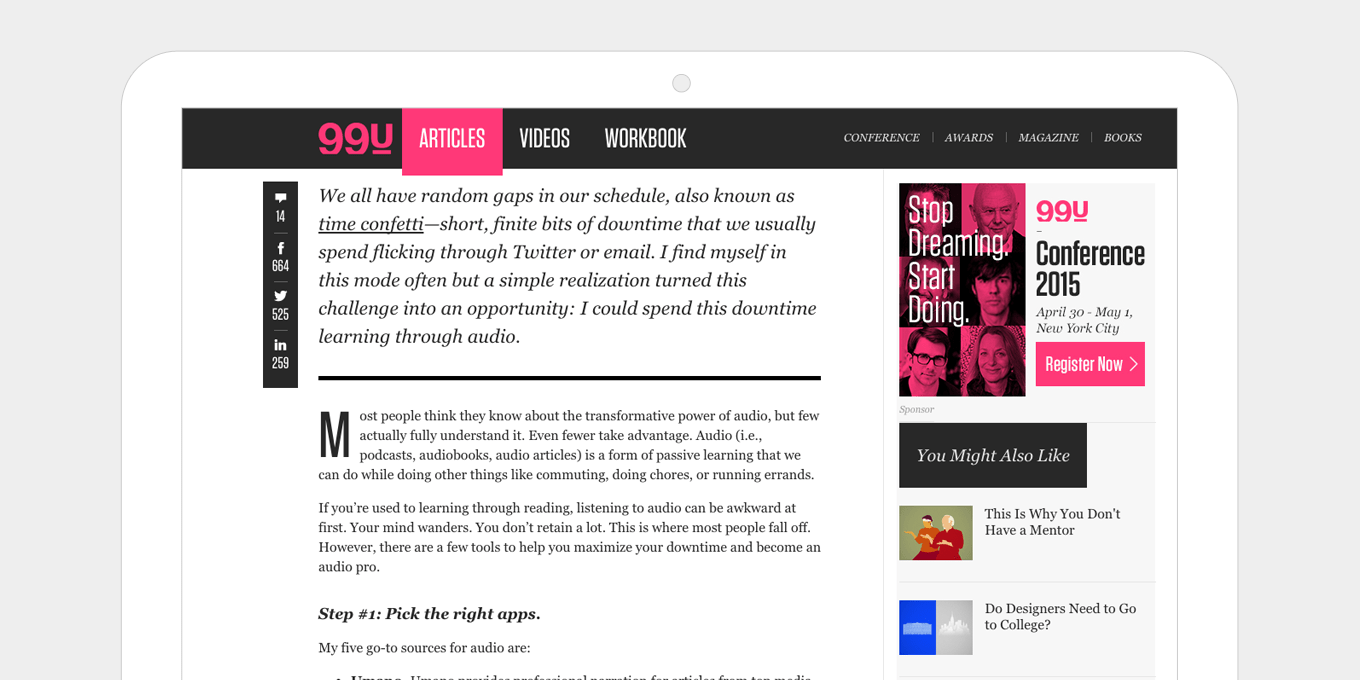
99u keeps their pages well balanced with optimum reading widths, simple share links and a well positioned sidebar that doesn’t detract too much from the article.

optimal-reading-widths-responsive-web-design

As well as having the right reading widths, The Guardian’s article layout is uncomplicated, with lots of white space and a clear, clutter-free sidebar.

6. Put important information near the top on mobile.

Show telephone numbers, contact info, buy now call to actions, etc. at the top on mobile. Mobile users want information quickly, but this also works well on any device.

Even with browser sizes being so varied now and the idea of the “fold” not really existing anymore, putting key call to actions at the top of the page is still important. For example, on a ecommerce product details page it’s good to have the “Add to Basket” button visible to the majority of users, without them having to scroll.

top-responsive-web-design

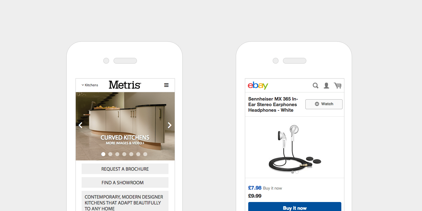
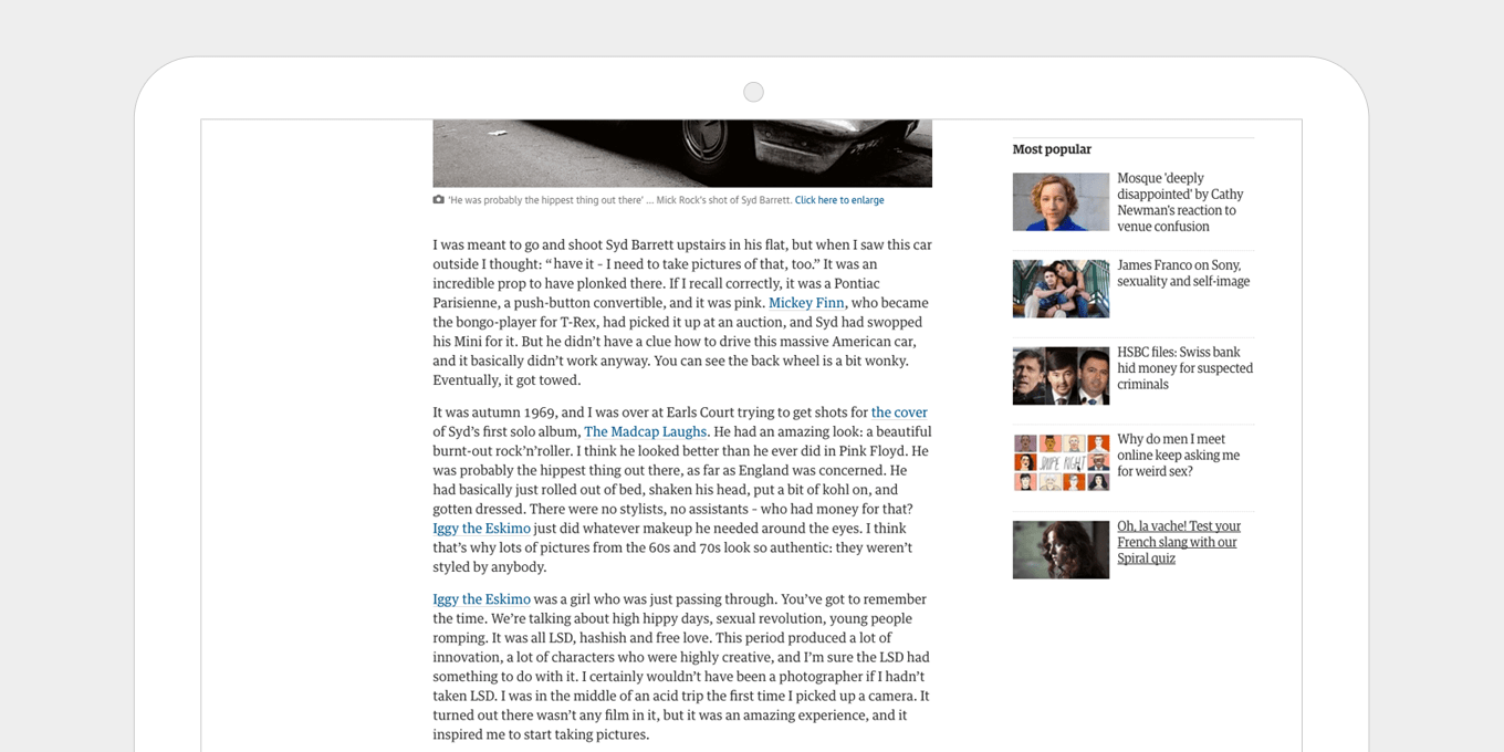
Metris Kitchens places it key information near the top on mobile as it is important for their users to see contact info (find a showroom) and conversion actions (request a brochure) clearly and quickly.

Ebay makes sure that the price and the buy it now button are clearly visible on mobile.

7. Change the order of content blocks when they collapse on smaller screens.

Decide what is more important to show first on a small screen, then change the content order around – this can be achieved through CSS (and sometimes JS if the layout is too complex).

If on desktop there is a text content block and an image block positioned next to one another, decide what is more relevant.

Or a sidebar and a content area on a page – on mobile if this collapses then the sidebar would be first, and would push all the content down the page, therefore it would be good to swap this around on mobile.

content-order-responsive-web-design

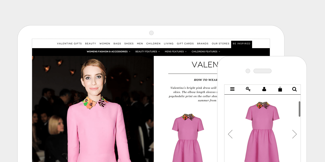
In this editorial content piece from Brown Thomas, the product info is positioned first on mobile. On desktop the content order is swapped around so that a lifestyle shot appears next to the product.

content-block-order-responsive-web-design

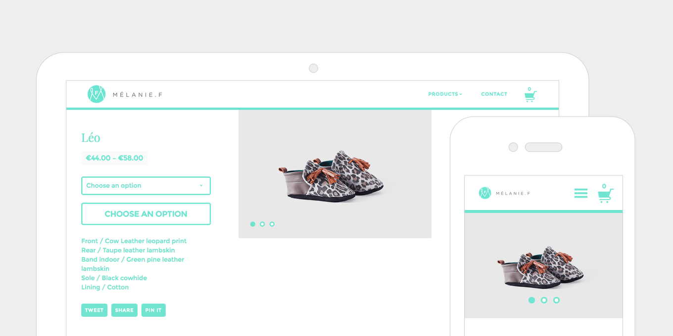
The Melanie F product details page places the product image first on mobile, then pushes up the product info to sit side by side on desktop.

8. Hiding content on smaller screens.

On mobile you can simplify the layout by hiding content that would be visible on larger screens, either by hiding it completely or using tabs and accordions to show/hide content. This declutters the page on smaller screens and lets the user see all the key info, with options to view more if they wish.

hidden-content-responsive-web-design

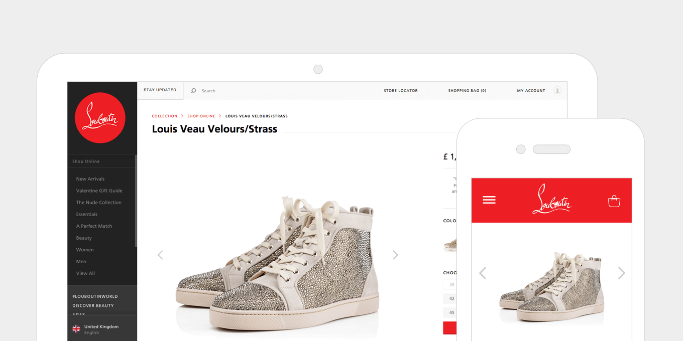
This product page on christianlouboutin.com simplifies it’s header and reduces product info on mobile, leaving the product image as the first content block.

hiding-content-responsive-web-design

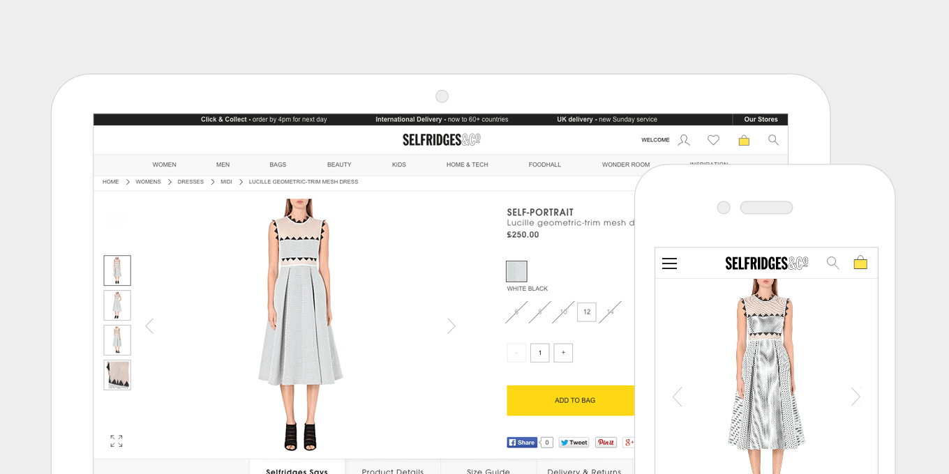
On Selfridges the carousel of thumbnail images is removed on mobile, leaving just simple left/right arrows to swipe through.

9. Showing more content on wider screens.

Having a wider screen allows you to push more content further up the screen. More content is visible to the user straight away, before they have to scroll. Layouts can expand and accommodate more columns.

more-content-responsive-web-design

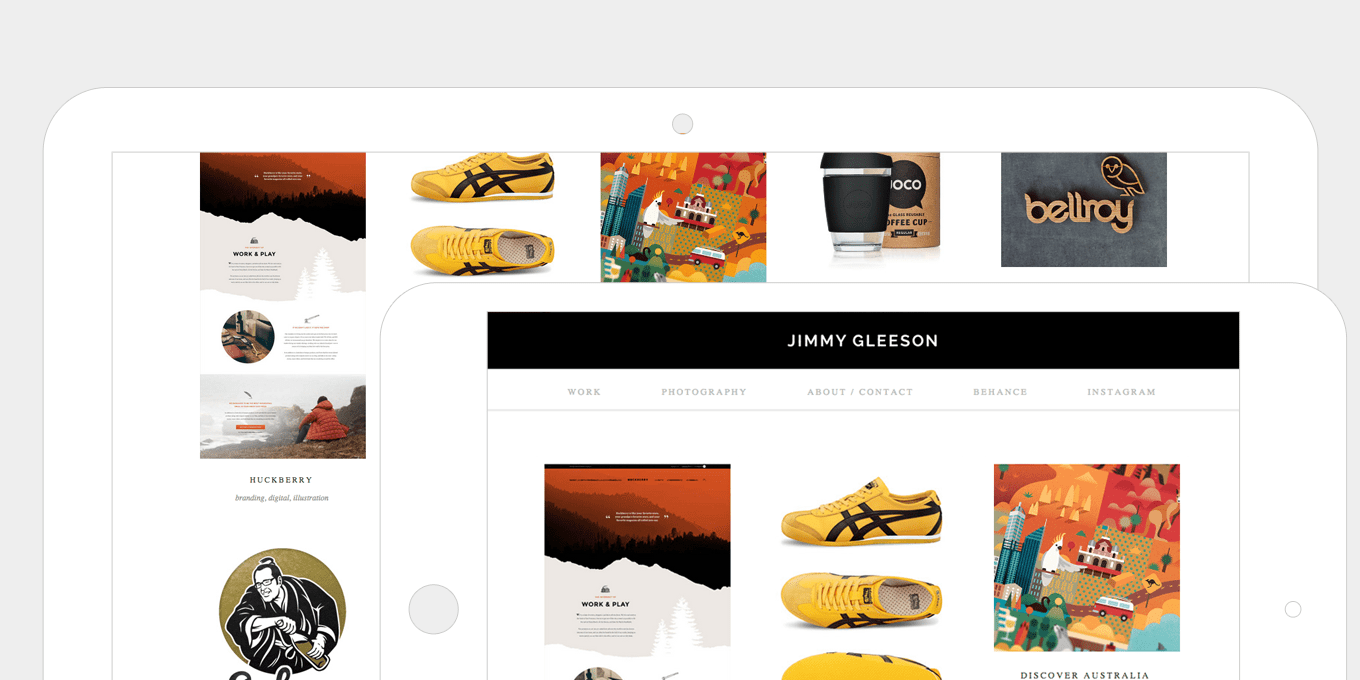
This portfolio grid view on Jimmy Gleeson increases it’s number of visible items as the screen gets’ wider, allowing more more content to be shown further up the page.

more-content-shown-responsive-web-design

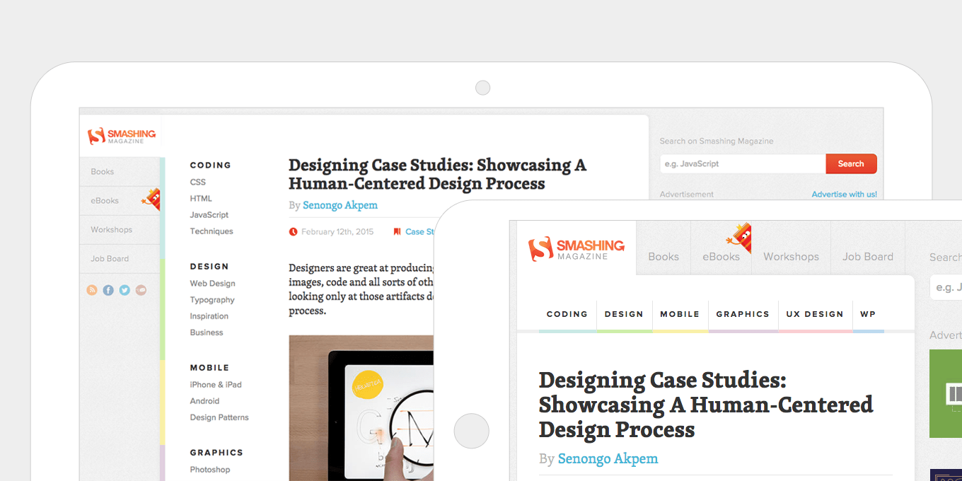
Smashing Magazine’s navigation layout is quite complex and changes a lot across different screen sizes. This is a good example of really thinking about the layout and maximising all space available per device and screen size.

10. Don’t forget about tablets in portrait mode.

Sometimes this orientation either falls in with the small mobile layout, which is more basic and not utilising all the screen space available, or it gets lumped in with a desktop layout which can make the content all squashed up.

Better use of media queries in your css can get the layout just right.

tablets-portrait-responsive-web-design

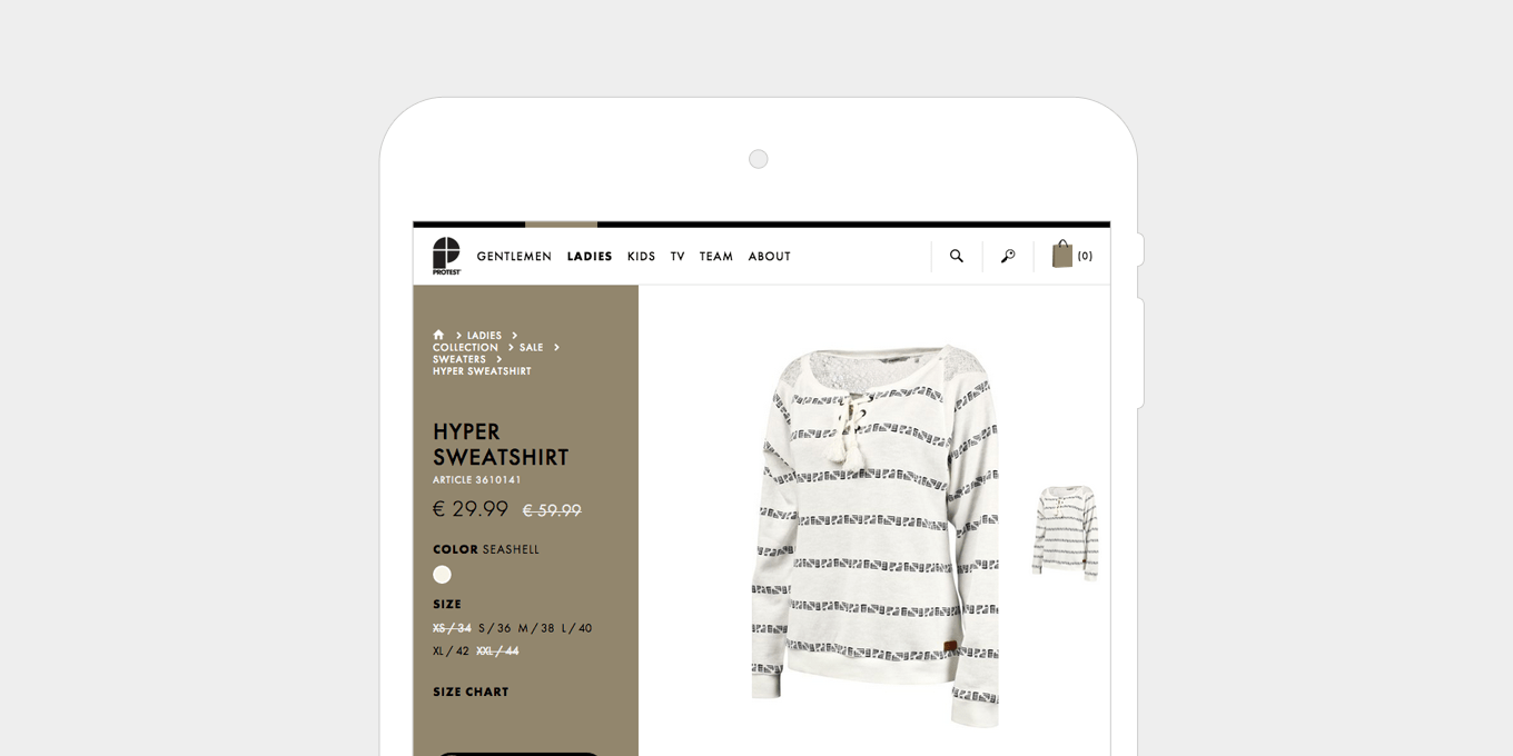
The layout on this Protest product details page still has a lot of information in a smaller space, without upsetting the proportions and spacing of the layout.

tablets-responsive-web-design

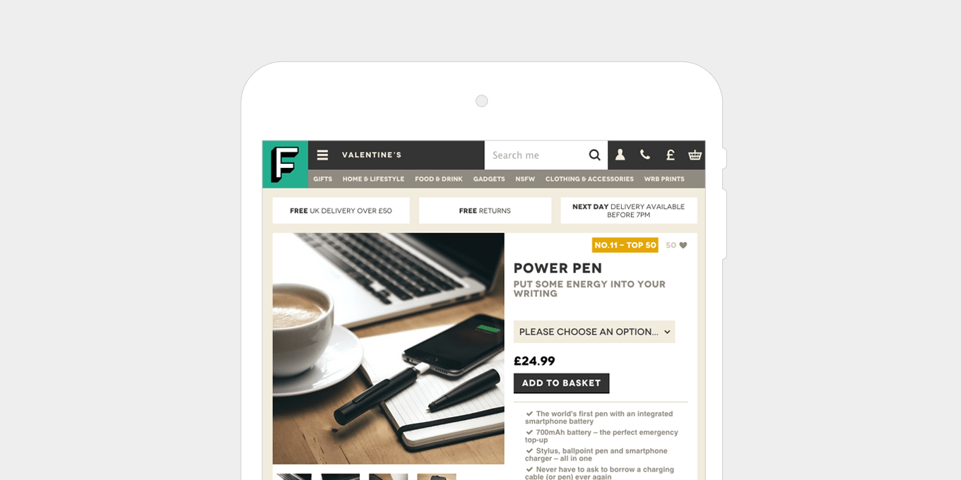
The Firebox product details layout doesn’t compromise anything in table portrait mode. Everything that appears on desktop is still there and the content is presented in a well balanced and simple way.

11. Replace enlarge image functionality with long scrollable gallery pages.

On small devices, having an enlarge image window doesn’t work if the image you are already looking at fills the screen.

For image galleries, use a long scrollable page, or a swipeable carousel with left/right arrows. The long scrollable gallery also works well on tablet and desktop.

image-gallery-responsive-web-design

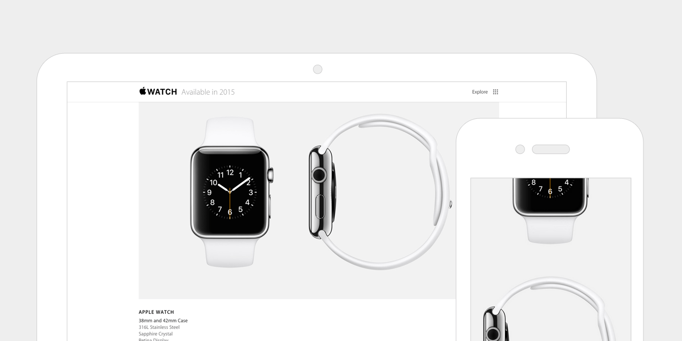
This image gallery on Apple uses a long scrollable page on desktop as well as mobile. The captions are removed on mobile to simplify the layout even more.

image-scrolling-responsive-web-design

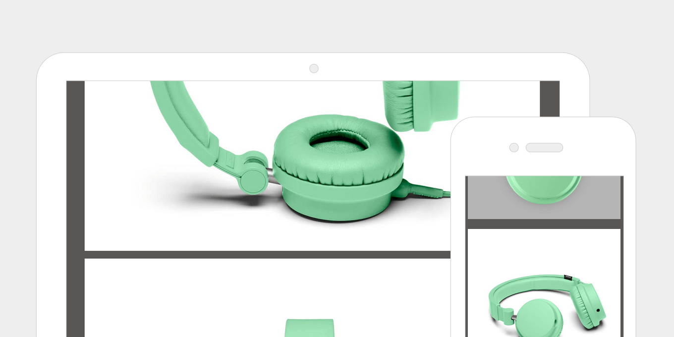
This product gallery on UrbanEars appears on the same page and expands down after pressing a link. It’s keeps the fundamental good parts of a popup, ie. not going to a new page, but then presents the images in a better, more usable way.

12. Optimise the UX for touch screens.

Add swipe gestures to banners, menus, image galleries etc.

Touch screens are by nature intuitive to use, therefore we can be more subtle with navigational aides, e.g half an image off the screen on a carousel suggests that there is more content to come.

Hover events are inconsistent on touch screens. Disable these and replace with touch events. If the content to be displayed on hover isn’t critical and just fancy embellishment, then disable it on touch screens all together.

ux-responsive-web-design

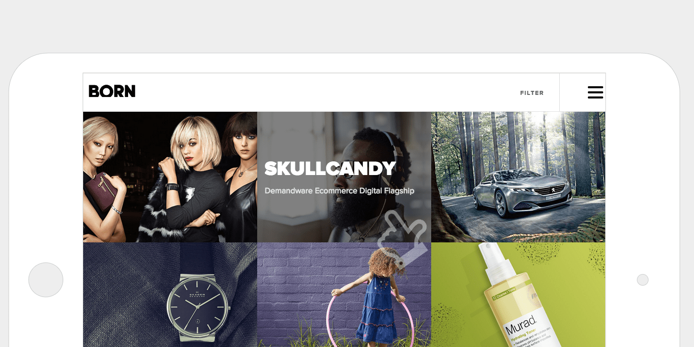
The hover states on the Born Group’s portfolio page are animated on desktop, and show the title of the project. As this information still needs to be accessible on touch screens the hover events are replaced with touch events – one tap to view info, then another tap to view the project.

ux-touch-responsive-web-design

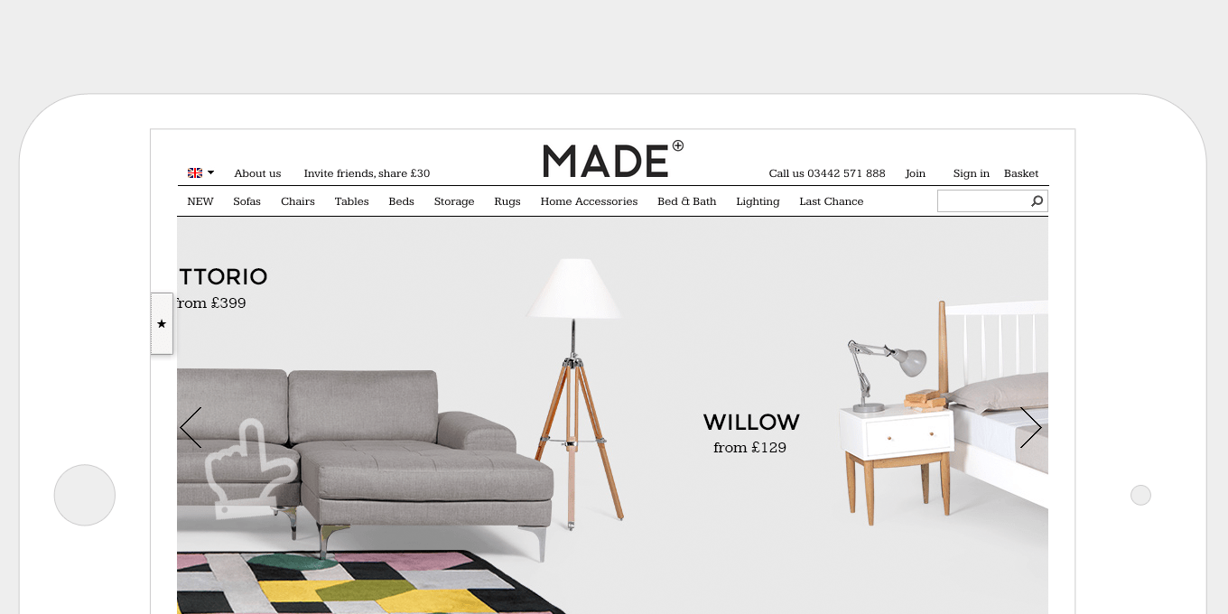
The Made site added swipe events to it’s home page banner. They clearly thought about their users and utilises these touch events on the rest of the site, on places where it is natural to swipe – for example, on a carousel of products.

13. Use less images.

A lot of effects, like background gradients and button hover states, can be achieved by pure html & css. Pages load faster, which is especially good for mobile, and less time is wasted creating lots of graphics.

Using fonts for your icons means you don’t have to create images. They are scalable, have cleaner edges, load faster, and are good for retina displays. This optimisation works great on all devices and screens.

images-less-responsive-web-design

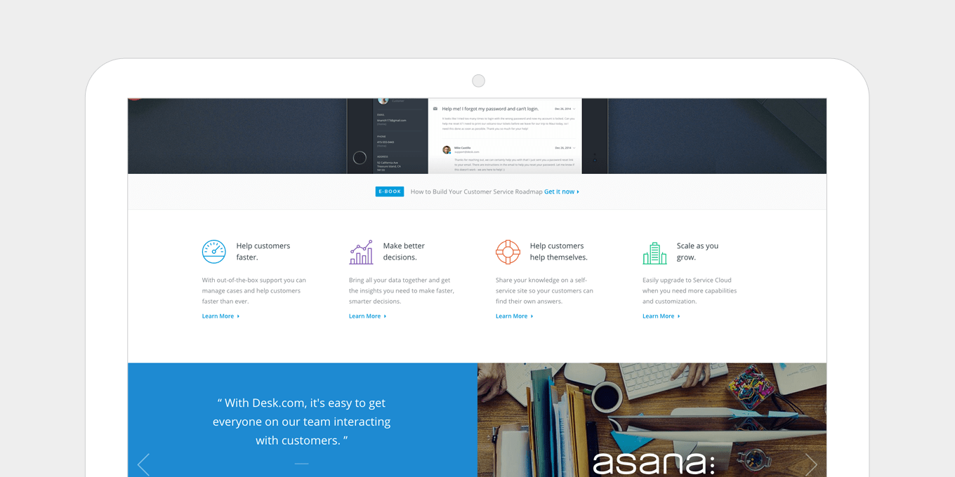
The desk.com site uses icon fonts well. Adding colour, which is as easy as changing a font colour, is a great way to add more impact to your page.

images-use-less-responsive-web-design

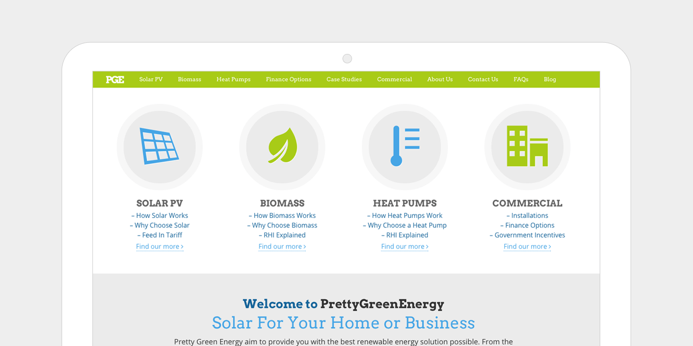
The Pretty Green Energy site uses large icon fonts for it’s section headers. Increasing the size of icon fonts is straightforward and does not require editing images.

14. Responsive videos.

This method allows for videos of any size to respond to device size automatically, without having to set explicit heights or widths on the video itself.

It’s achieved with only a few lines of css. This works well with videos inserted directly on the page and in iframes.

videos-responsive-web-design

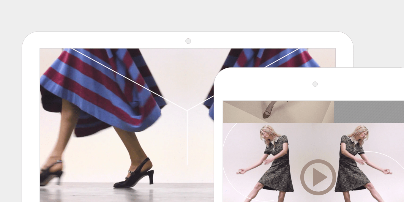
The videos on Anyilu stretch across the page and fill the whole space. This gives the page great impact. They respond and resize automatically on different screen sizes.

video-responsive-web-design

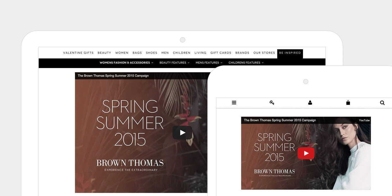
The embedded video’s on Brown Thomas use iframes and are fully responsive. No heights or widths are specified, allowing easy content management and quick page creation.

15. The fold no longer exists.

Devices are smaller, taller, wider, and longer.

It’s not important to cram everything at the top of the page. Let pages breath and expand with long, flowing content blocks and generous spacing.

People naturally scroll. By giving them more content below the “fold” you’re actually inviting them to be more engaged with the page and to read your content.

fold-responsive-web-design

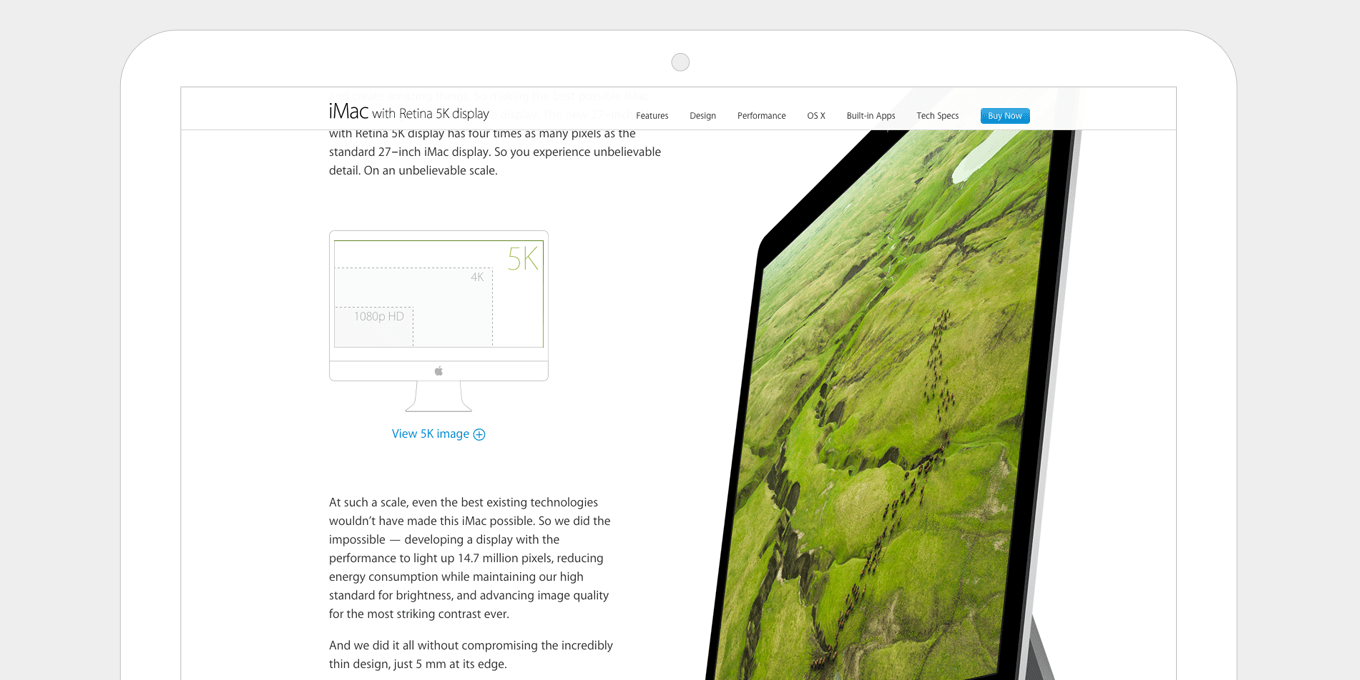
The iMac product page on Apple is a long, flowing page, with lots happening as you scroll. The experience pulls you in. They also utilise a fixed nav, so that the key call to actions, i.e. Buy Now, are still visible as you move down the page.

fold-none-responsive-web-design

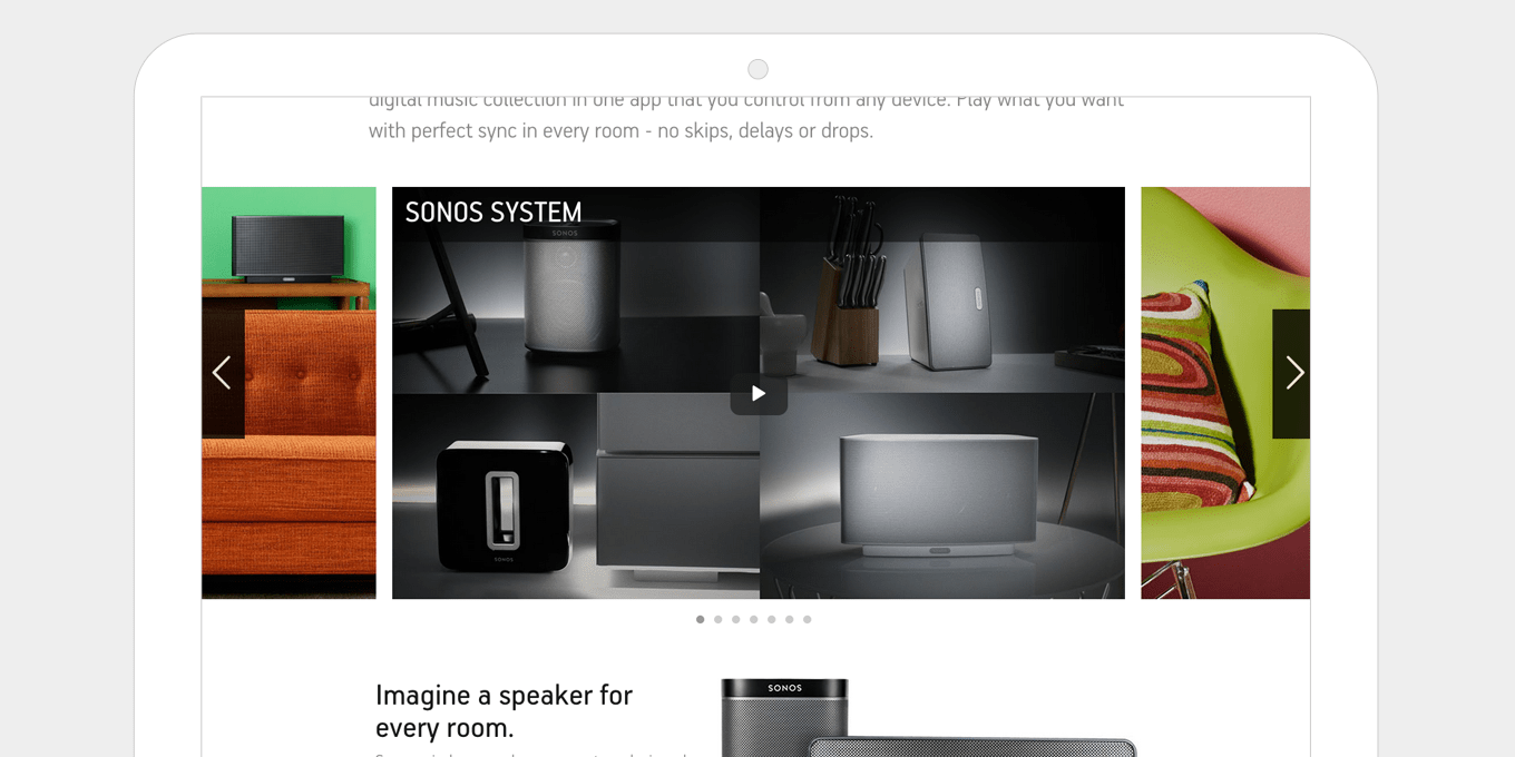
The Sonos product pages have a good balance between fixed width content text blocks and wider, full screen image panels. This keeps the page interesting and more engaging as you scroll. The spacing is well balanced without it being overcrowded.

Wrapping Up

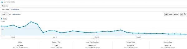
Check your Analytics. I bet mobile traffic is a higher percentage than you think. And I bet it’s growing month-to-month.

If your site isn’t responsive, every single mobile user that comes to your site is having a bad experience.

Even if it is responsive, I’m sure there are a number of areas where it can be improved.

Responsive web design is my specialty. I can work on any website, WordPress, Modx or otherwise. My clients typically have at least 10,000+ monthly visits and I charge $1,500 – $3,000 depending on the complexity of your site.

Hire me once, I’ll do the job right, and you’ll never have to worry about a bad mobile experience ever again.


9 ‘Set and Forget’ Ways To Increase Sales On Your Website 2021

9 ‘Set and Forget’ Ways To Increase Sales On Your Website 2021


The easiest way for most people to increase sales from their website, is to increase conversions. In this post, I’m going to share with you our best tips for doing exactly that.

If You Want To Increase Sales Consider this:

You are making $1000/month from selling an eBook on your blog.

So if you want to make $3000/month, you should add two new eBooks.

But is that the best way to spend your time?

Will that give you the best ROI?

There is no doubt more products will mean more money, but in most people’s cases, you can make more money quicker, if you focus on what’s already making your money.

Improving our checkout page doubled our sales.

Adding a popup opt-in doubled the amount of people that signed up for our list. Our sales come from emails, so again, this doubled how much we were making.

When we significantly increased our page speed, our search engine traffic went up, people spent more time on our site and conversions went up too. All we had to do was spend 5 minutes hiring a page speed expert.

There are opportunities all around us. If you’re not satisfied with where you are right now, perhaps you should ask yourself, what isn’t working as well as it could.

Start here:

Our 9 Favorite Tips To Increase Sales and Conversions

#1. Increase Sales By Adding Upsells to Current Products

Most decent online marketers make as much money on the back end as they do on the front end.

By that I mean, if they sell a $97 product, when a customer goes through the checkout process, they spend at least another $97 on other products before they complete their purchase.

When I first heard about this, I thought it was an unbelievable statistic. Surely you can’t increase sales by 100% by doing something so simple.

We couldn’t ignore something that sounded so promising.

The first upsell we ever created was for PopUp Domination. Customers would buy our software, then during the checkout process, get offered purchasing options for multi-site licenses and additional popup designs. Incredibly, over night we were able to increase sales by 2x!

It makes perfect sense. The customer is already in buy-mode, they have already got their credit card out and ready to buy something. It’s impulse. They see something else they like that’s related and all they have to do is click one extra button.

Our good friend Yanik Silver had a rule of thumb I like to quote:

“60% of people should take your first upsell if it is priced at 60% of the front-end product price.”

That would be a good place to start for most people.

So for example; if your front end product sells at $49, an upsell priced at $27 should convert well.

The only problem we have ever had with creating upsells is the technical side of things. The first time we did it, we had to ask customers to re-enter their credit card details for every upsell they wanted to buy.

No doubt this had a negative effect on conversion. Although we were still able to achieve that industry standard of making just as much from our upsells as the front end offer.

We are not tech guys and even asking a programmer to set something up like this can be a pain because it’s just not something people have much experience with.

However things have moved along quite a lot since we first played with setting up upsells.

Our current checkout software SamCart, allows you to create upsells in seconds. All you have to do is insert the sales video code, set the price and it’s done.

Customers go from purchasing a product, to upsell page 1, upsell page 2 and finally the download page.

Here’s how we setup our upsells:

  1. Click upsells on the left hand side of your SamCart dashboard and then select funnels from the drop down menu.
  2. Click “new funnel”, add your funnel name and a short description, then click “create funnel”.
  3. Select how many upsell offers you’d like to add from your product list and then select “enabled.” You’ll have the option to add up to 5 upsells and 5 downsells.

Increase Sales With Upsells

#2. Increase Sales By Improving Your Checkout Page

The checkout page is a huge part of the sales funnel process, and is often forgotten or brushed off. 

I remember 6 years ago reading a forum thread about the beta stage of Clickbank checkout page design. They allowed premier users (top earners) to customize the design of their checkout page from the default 1 style design. Users saw as much as 3x higher conversions by simply matching the header and background color to the one used on their sales page.

Checkout pages should have the following characteristics:

  1. Sales copy reminding customers of exactly what they’re getting.
  2. Branding that matches your main site.
  3. Product image.
  4. Clear instructions.
  5. Satisfaction Guarantee.

Another top tip to increase sales is to remove any checkout fields that are not 100% required. The easier it is to sign up and pay, the higher your conversions will be.

Our checkout pages are hosted and setup with SamCart, which makes the process incredibly easy.

SamCart Checkout Page

#3. Increase Sales by Adding a PopUp Opt-in Box

If you make money from email marketing, then I would be surprised if you didn’t already have a popup on your website, but incase you don’t, we recommend you try adding OptiMonk to your websites.

When we first added a popup to IncomeDiary, our email subscriber rate increased by over 500%! Never have we seen conversion rates like that before.

Make sure to read our OptiMonk review to learn how we are using it to boost our sales and traffic.

#4. Launch an Affiliate Program

Having an affiliate program has allowed us to do $x,xxx,xxx in sales with zero advertising budget.

Affiliate programs give you the ability to track and pay people on commission for selling your products. Take PopUp Domination as an example. We let customers promote our sales page with a special tracking link. If they convince someone to click the link and they end up buying from us, we give that person a cut of the money for bringing us the business. This is all handled effortlessly by our merchant.

This is a great, low risk way to drive traffic to your sales pages. You only have to pay for the traffic that converts.

Affiliate programs are among the best ways to incorporate passive income streams into your business. Once your sales page is setup and you have affiliates promoting your products, you don’t have to do anything to drive traffic and make sales.

Increase Sales With Affiliates

#5. Setup Autoresponders

One of the best ways to increase sales (and passive income), is to have an autoresponder.

An autoresponder automatically sends emails to subscribers that you have setup before hand. We use them for all of our mailing lists. When you subscribe to our list, you will automatically receive an email from us. Then again the next day and again two days later and so on, until all 30 emails have been sent. This means you can write a sales email today, then in the weeks to come when someone subscribes, they’ll get that email automatically, read it and hopefully buy whatever you are selling.

As far as we are concerned, the more autoresponder emails the better. We regularly look back over past emails we’ve sent to our lists, copy our most successful ones and add them to our autoresponder.

Autoresponders have been one of the most powerful passive income streams we have ever used. Everyone should have a mailing list and everyone should be sending emails. It doesn’t matter if you are a blogger, software owner, if you sell eBooks or want more clients.

To get started, we recommend and use Aweber for our email marketing! They currently have a $1 trial.

Follow-Up

#6. Increase Sales & Conversions By Increasing Page Speed

Speeding up your website is a guaranteed way to get more traffic and increase sales.

Google openly states that page speed is part of their search algorithm. Which makes sense because they want to connect their users with the best match. The best match is not a slow loading website that infuriates you.

We do a combination of things to increase our page speed. You can read more about it here.

The most important being:

1. Perfect code. Be careful which WordPress theme you are using.

2. Minimize page load by not having things slow the site down. One thing a lot of people do is have far to many WordPress plugins.

3. Pick the right host.

4. Use caching software. We use MaxCDN to significantly speed up our site & decrease server load. MaxCDN duplicates your website content across several servers globally, which presents your visitors with website content from whichever server is closest to their location. This increased proximity decreases page load time.

maxcdn

#7. Make Your Site Mobile Responsive

One in every three minutes spent online, is via a mobile device. If your website isn’t responsive, you’re losing money. Our websites are made with Genesis framework and all of our sales pages are created with OptimizePress. Both platforms are 100% mobile responsive!

Check out 15 best practices for responsible responsive web design.

optimizepress responsive

#8. Increase Sales Page Conversions With Split Testing

Split testing is crucial for making money online and is something all successful marketers do on a regular basis. Most have tests continually running.

A split test is when you split your web traffic between multiple pages to see which one converts higher. For example, think of any sales page, now duplicate it, so you have two exact same versions of this page. Change one of the pages so that the buy button is a different colour. Now send 50% of your traffic to each of these two pages. After 100 sales, see which one made the most money.

There is a lot you can test. And you would be surprised how much small things can add up. Here is a list of things to start testing:

  • Headlines text, colour, font, size
  • Background colours
  • Images
  • Videos
  • Videos Vs Images
  • Video Vs Text
  • Short Vs Long
  • Price
  • Scarcity
  • What you are offering
  • Name of your product
  • Testimonials
  • Guarantee

I could go on for quite some time… you can test EVERYTHING!

Both SamCart and OptimizePress allow us to split test our checkout pages as well as sales pages to ensure the highest possible conversions regardless of the product.

converion-test

#9. Don’t Keep All Your Eggs In One Basket.

There are quite a few reasons why this saying is true for online business.

Firstly, if you only have one income stream, then you are screwed if for whatever reason it disappears. And don’t think that’s impossible because it’s happened thousands of times, to people far smarter then you or I. Let me give you an example:

Say you are a blogger and have 5 different income streams for your blog. You are making a lot of money. You should feel safe right?

NOPE.

Not if all your traffic comes from one source. Often I’ve heard horror stories of top bloggers being slapped by Google and losing all their traffic, therefor losing all their income.

You can’t set and forget about a business if it has a foundation like this. Diversify and make sure you have multiple traffic sources such as Search Engines, Social Media, Podcasting, Email Marketing and so on.

Ok, let’s put traffic aside and focus on blog monetization techniques.

Say your site is getting great traffic and it’s all good, but you only make money from Google Adsense.

Well Google can come along and ban you for 1 of a million terms violations. Again you are screwed.

Ok, it’s 2017, not many people do that. How about you sell an eBook online and all your income comes from that. You are doing great, in fact this month is your best month ever, you made $30,000!

Perfect, no troubles, right?

WRONG!

Your merchant shuts you down or puts you on hold because it’s worried you may be doing something fraudulent. Countless times I’ve heard online marketers moan about how their PayPal accounts have been put on hold for months and they can’t withdraw money. Why? Because PayPal would rather be safe than sorry. Although in most cases, PayPal eventually took these people off hold, how would you deal with not being able to access your money for months on end?

google-penalty

Another reason not to keep all your eggs in one basket is it just isn’t a smart business decision.

Take IncomeDiary for example. Say you are coming to the site today and the only adverts we have up are for our PopUp Domination software. If you already have a copy of it, then you can’t buy anything. These adverts are irrelevant. People love choice and you need to be able to show them multiple things they can buy to have the best chance of making a sale.

Like life, variety is key to business.

You must diversify.

There is so much you can do.

So many opportunities you are not taking advantage of yet.

I hope today’s post has shown you that.

There you have it, our 9 top ways to improve your website, to increase sales and conversions. Enjoy.


Making a Kali Bootable USB Drive in Windows , Mac and Linux 2021

Making a Kali Bootable USB Drive in Windows , Mac and Linux 2021


Our favourite way, and the fastest method, for getting up and running with Kali Linux is to run it “live” from a USB drive. This method has several advantages:

  • It’s non-destructive — it makes no changes to the host system’s hard drive or installed OS, and to go back to normal operations, you simply remove the “Kali Live” USB drive and restart the system.
  • It’s portable — you can carry Kali Linux in your pocket and have it running in minutes on an available system
  • It’s customizable — you can roll your own custom Kali Linux ISO image and put it onto a USB drive using the same procedures
  • It’s potentially persistent — with a bit of extra effort, you can configure your Kali Linux “live” USB drive to have persistent storage, so the data you collect is saved across reboots

In order to do this, we first need to create a bootable USB drive which has been set up from an ISO image of Kali Linux.

Windows

What You’ll Need for Windows 

  1. verified copy of the appropriate ISO image of the latest Kali build image for the system you’ll be running it on: see the details on downloading official Kali Linux images.

  2. If you’re running under Windows, there is not one tool that is considered the overall best for imaging. We recommend Etcher, however Rufus  https://rufus.ie/

  3. is another popular option. If one does not work for you, consider the other.

  4. A USB thumb drive, 4GB or larger. (Systems with a direct SD card slot can use an SD card with similar capacity. The procedure is identical.)

Kali Linux Live USB Install Procedure

The specifics of this procedure will vary depending on whether you’re doing it on a WindowsLinux, or macOS/OS X system.

Creating a Bootable Kali USB Drive on Windows (Etcher)

  1. Plug your USB drive into an available USB port on your Windows PC, note which drive designator (e.g. “F:\“) it uses once it mounts, and launch Etcher.

  2. Choose the Kali Linux ISO file to be imaged with “select image” and verify that the USB drive to be overwritten is the correct one. Click the “Flash!” button once ready.

3. Once Etcher alerts you that the image has been flashed, you can safely remove the USB drive and proceed to boot into Kali with it.


macOS/OS X 


What You’ll Need

  1. verified copy of the appropriate ISO image of the latest Kali build image for the system you’ll be running it on: see the details on downloading official Kali Linux images.

  2. If you’re running under macOS/OS X, you can use the dd command, which is pre-installed on those platforms, or use Etcher.

  3. A USB thumb drive, 4GB or larger. (Systems with a direct SD card slot can use an SD card with similar capacity. The procedure is identical.)

Kali Linux Live USB Install Procedure

The specifics of this procedure will vary depending on whether you’re doing it on a WindowsLinux, or macOS/OS X system.

Creating a Bootable Kali USB Drive on macOS/OS X (DD)

macOS/OS X is based on UNIX, so creating a bootable Kali Linux USB drive in an macOS/OS X environment is similar to doing it on Linux. Once you’ve downloaded and verified your chosen Kali ISO file, you use dd to copy it over to your USB stick. If you would prefer to use Etcher, then follow the same directions as a Windows user. Note that the USB drive will have a path similar to /dev/disk2.

WARNING: Although the process of imaging Kali on a USB drive is very easy, you can just as easily overwrite a disk drive you didn't intend to with dd if you do not understand what you are doing, or if you specify an incorrect output path. Double-check what you're doing before you do it, it'll be too late afterwards. Consider yourself warned.

  1. Without the USB drive plugged into the system, open a Terminal window, and type the command diskutil list at the command prompt.

  2. You will get a list of the device paths (looking like /dev/disk0/dev/disk1, etc.) of the disks mounted on your system, along with information on the partitions on each of the disks.

3. Plug in your USB device to your Apple computer’s USB port and run the command diskutil list a second time. Your USB drive’s path will most likely be the last one. In any case, it will be one which wasn’t present before. In this example, you can see that there is now a /dev/disk6 which wasn’t previously present.

4. Unmount the drive (assuming, for this example, the USB stick is /dev/disk6 — do not simply copy this, verify the correct path on your own system!):

% diskutil unmountDisk /dev/disk6
  1. Proceed to (carefully!) image the Kali ISO file on the USB device. The following command assumes that your USB drive is on the path /dev/disk6, and you’re in the same directory with your Kali Linux ISO, which is named “kali-linux-2020.2-live-amd64.iso”. We will replace /dev/disk6 with /dev/rdisk6 to improve the write speeds:

    % sudo dd if=kali-linux-2020.2-live-amd64.iso of=/dev/rdisk6 bs=4m

Increasing the blocksize (bs) will speed up the write progress, but will also increase the chances of creating a bad USB stick. Using the given value on macOS/OS X has produced reliable images consistently.

Imaging the USB drive can take a good amount of time, over half an hour is not unusual, as the sample output below shows. Be patient!

The dd command provides no feedback until it’s completed, but if your drive has an access indicator, you’ll probably see it flickering from time to time. The time to dd the image across will depend on the speed of the system used, USB drive itself, and USB port it’s inserted into. Once dd has finished imaging the drive, it will output something that looks like this:

2911+1 records in
2911+1 records out
3053371392 bytes transferred in 2151.132182 secs (1419425 bytes/sec)

And that’s it!


Creating a Bootable Kali USB Drive on macOS/OS X (Etcher)

Alternatively, Etcher can be used.

  1. Download and run Etcher.

  2. Choose the Kali Linux ISO file to be imaged with “select image” and verify that the USB drive to be overwritten is the correct one. Click the “Flash!” button once ready.

3. Once Etcher alerts you that the image has been flashed, you can safely remove the USB drive.

You can now boot into a Kali Live / Installer environment using the USB device.

To boot from an alternate drive on an macOS/OS X system, bring up the boot menu by pressing the Option key immediately after powering on the device and select the drive you want to use.

For more information, see Apple’s knowledge base.


LINUX


What You’ll Need for Linux

  1. verified copy of the appropriate ISO image of the latest Kali build image for the system you’ll be running it on: see the details on downloading official Kali Linux images.

  2. If you’re running under Linux, you can use the dd command, which is pre-installed, or use Etcher.

  3. A USB thumb drive, 4GB or larger. (Systems with a direct SD card slot can use an SD card with similar capacity. The procedure is identical.)

Kali Linux Live USB Install Procedure

The specifics of this procedure will vary depending on whether you’re doing it on a WindowsLinux, or macOS/OS X system.

Creating a Bootable Kali USB Drive on Linux (DD)

Creating a bootable Kali Linux USB key in a Linux environment is easy. Once you’ve downloaded and verified your Kali ISO file, you can use the dd command to copy it over to your USB stick using the following procedure. Note that you’ll need to be running as root, or to execute the dd command with sudo. The following example assumes a Linux Mint 17.1 desktop — depending on the distro you’re using, a few specifics may vary slightly, but the general idea should be very similar. If you would prefer to use Etcher, then follow the same directions as a Windows user. Note that the USB drive will have a path similar to /dev/sdb.

WARNING: Although the process of imaging Kali Linux onto a USB drive is very easy, you can just as easily overwrite a disk drive you didn't intend to with dd if you do not understand what you are doing, or if you specify an incorrect output path. Double-check what you're doing before you do it, it'll be too late afterwards. Consider yourself warned.

  1. First, you’ll need to identify the device path to use to write the image to your USB drive. Without the USB drive inserted into a port, execute the command sudo fdisk -l at a command prompt in a terminal window (if you don’t use elevated privileges with fdisk, you won’t get any output). You’ll get output that will look something (not exactly) like this, showing a single drive — “/dev/sda” — containing three partitions (/dev/sda1, /dev/sda2, and /dev/sda5):

2. Now, plug your USB drive into an available USB port on your system, and run the same command, “sudo fdisk -l” a second time. Now, the output will look something (again, not exactly) like this, showing an additional device which wasn’t there previously, in this example “/dev/sdb”, a 16GB USB drive:

3. Proceed to (carefully!) image the Kali ISO file on the USB device. The example command below assumes that the ISO image you’re writing is named “kali-linux-2020.2-live-amd64.iso” and is in your current working directory. The blocksize parameter can be increased, and while it may speed up the operation of the dd command, it can occasionally produce unbootable USB drives, depending on your system and a lot of different factors. The recommended value, “bs=4M”, is conservative and reliable.

dd if=kali-linux-2020.2-live-amd64.iso of=/dev/sdb bs=4M

Imaging the USB drive can take a good amount of time, over ten minutes or more is not unusual, as the sample output below shows. Be patient!

The dd command provides no feedback until it’s completed, but if your drive has an access indicator, you’ll probably see it flickering from time to time. The time to dd the image across will depend on the speed of the system used, USB drive itself, and USB port it’s inserted into. Once dd has finished imaging the drive, it will output something that looks like this:

5823+1 records in
5823+1 records out
3053371392 bytes (3.1 GB) copied, 746.211 s, 4.1 MB/s

That’s it, really!


Creating a Bootable Kali USB Drive on Linux (DD with status)

Alternatively there are a few other options available for imaging.

The first option is dd with a status indicator. This is only available on newer systems however. To do this, we simply add the status flag.

dd if=kali-linux-2020.2-live-amd64.iso of=/dev/sdb bs=4M status=progress

Another option is to use pv. We can also use the size flag here to get an approximate timer. Change the size depending on the image being used.

dd if=kali-linux-2020.2-live-amd64.iso | pv -s 2.8G | dd of=/dev/sdb bs=4M

Creating a Bootable Kali USB Drive on Linux (Etcher)

The third is Etcher.

  1. Download and run Etcher.

  2. Choose the Kali Linux ISO file to be imaged with “select image” and verify that the USB drive to be overwritten is the correct one. Click the “Flash!” button once ready.

3. Once Etcher alerts you that the image has been flashed, you can safely remove the USB drive.

You can now boot into a Kali Live / Installer environment using the USB device.