Wednesday, August 19, 2020

5 Design Features Guaranteed to Boost Sales and Conversions 2021

5 Design Features Guaranteed to Boost Sales and Conversions 2021


Design Features Guaranteed to Boost Sales and Conversions

Is there anything better than a beautifully designed website?

Actually yes, there is…

A beautifully designed website that boosts sales and conversions.

Chances are, you might be using a website or landing page that just plain sucks at converting visitors into completed goal actions, or in simpler terms – conversions. As the saying goes:

You can have all the traffic in the world, but if your website can’t convert that traffic, then you have a crap website.

I’m not actually sure who coined that saying, and I might have just made that up. But, it’s true nonetheless.

If you’ve been wrestling with your website, trying to improve it’s conversions and you’ve found yourself hitting a brick wall then I want to help you fix it.

Today, I’m going to reveal my all-time top 5 design ‘hacks’ that are guaranteed to boost sales and conversions, and make your business look amazing in the process. And best of all, you’re going to love them.

But first, who am I and why listen to me?

I’m not here to talk about me, so I’ll keep it short. I’ve been designing high converting websites and landing pages and everything in between since 2005. I own and operate Boost Design, a successful design studio that focuses only on high-converting design.

Over the years I’ve learned and experimented with tonnes of design tricks and ‘hacks’ that can seriously bolster up conversions and help improve a business’ bottom line.

Before we dive into the meat of this post, let me ask you a few quick questions.

What would a 20% increase in email list subscribers mean to your business? What about an extra 1% on top of your salespage conversions, or a 150% increase in lead inquiries?

I’m not sure about you, but I know these figures can be business changing.

And, of course, I’m not guaranteeing you’ll see the same results, but if you follow along and implement these design features into your website and business then you’ll be well on your way.

Before we move forward, I just want to say that you don’t need to be a design pro to implement these features into your websites and landing pages. The design customisation level in many WordPress themes and page builders is at an all-time high and you should be able to do a great job with those alone.

However, I am biased and I do totally recommend hiring a pro designer to do this once your business has reached a certain level.

Now with that said, let’s dive into my five top design hacks and features:

1. High-Converting Typography

Typography and the fonts you choose to use on your website can have a huge impact on readability, which directly ties in to your conversion rates.

We’re at a time now when choosing fonts has never been easier and the volume of good, clean fonts – both free and premium – at our disposal has never been higher.

Free fonts sites like Google Fonts and Font Squirrel and premium font marketplaces like TypeKit and MyFonts means you’ll never be stuck finding the perfect font for your brand and website.

But when it comes down to it. Selecting typography for your website can be a fine art in itself.

You need to consider font families, sizes, weights and whether or not to use a serif or a sans-serif font.

It can all be a bit daunting, but luckily I have a few pointers for you.

Typography Do’s and Don’ts

  • Don’t use anymore than 3 font families on your website. Choose one for your headlines and subheadlines and one for your body text and paragraphs. You might also wish to use another font family sparingly, such as a script font for use in promos and secondary graphics.
  • I recommend using a clean sans-serif font as they’re optimal for screens and hand held devices like phones and tablets. Serif fonts, the fonts with ‘hands’ and ‘feet’ extruding from their characters are better suited for long-form reading, that’s why you’ll only ever see serif fonts being used in print books and e-readers.
  • For screens, a good font size for body and paragraph text is between 15 – 18px. At this size it’s not too small to be uncomfortable and not too big to have your users scroll or swipe unneccesarily.
  • Visit your favourite blogs and websites and take note of the font families they use. A good tool to find out what font a website is using is a plugin called Fount.

Body and paragraph fonts I recommend

Proxima Nova Font

Proxima Nova

A common reasonably priced premium font, but absolutely perfect for body text. If you want something slightly different and less common, I’d suggest the Proxima Nova Soft alternative.

Calibre

Calibre

An exquisite font and one that will set you back $50 per font style (eg. Regular, Bold). Calibre embodies professionalism, modernism and if you’re business is brand-savvy, it’s a great option to consider for both body and headline typography.

Roboto

Roboto

The ‘official’ Google font and one that’s similar to well known Helvetica, Roboto is a good standard font, although there’s nothing particularly special that I like about it, it just does it’s job.

Droid Serif

Droid Serif

Sometimes you can get away with using a serif font on screen, and very rarely can you do that. But the free Google font Droid Serif does just this. If you must use a serif font on screen, this is the one.

Circular

Circular

If you have a spare $1,000 lying around to spend on one font family, then you can’t go past Circular by Lineto. Outrageously expensive, but all the more beautiful, Circular is gaining traction as a popular font with it’s use in the Air BnB logo.

Body and paragraph fonts I recommend

Oswald

Oswald

Another free font and one that’s as common as a rainy day in London, Oswald is thin, stylish and allows you to squeeze a lot of characters on one line making it great for long sales page headlines.

Gibson Bold

Gibson Bold

A premium font that you can buy or sync from TypeKit, Gibson Bold is fantastic for big, bold, in-your-face headlines. However I wouldn’t recommend the other weights in this family, they just don’t look that great.

Sofia Pro

Sofia Pro

Another premium font, this is one of my favs. It’s clean, modern and perfectly balanced for headlines. I’d go with the Black weight for headlines.

Montserrat

Montserrat

Another free, and as such, over-used font, Montserrat is another one of those Google fonts that does it’s job, however I’m put off by how common it’s used.

You now have an education on typography and some options to consider when it comes down to font selection. Implement the advice and the fonts discussed here and I’m sure you’ll see some nice lifts in conversion and readability which will reduce your bounce rates too.

2. Killer Color Combinations

Ahhh colour. Who doesn’t appreciate colour, apart from goths?

When it comes to choosing what colours to use in your websites and landing pages, there really are no hard and fast rules. Choosing your colour palette is completely up to you, your brand and your target audience.

But there are a few do’s and don’ts to keep in mind.

Color Do’s and Don’ts

  • Never use more than 5 brand colours, unless your branding is rainbow-centric, which it probably isn’t. A good number of colours to use is four, with a shade and highlight for each colour. Your brand colours should be made up of a primary colour, a secondary colour, background colour and an accent colour.
  • Consider your target audience. If they’re predominantly male, you should probably steer clear of pinks and purples. Health industries work better with calming colours and smart use of whitespace, whereas fitness is can be quite open ended depending on demographics. I could talk about colour psychology until I’m blue in my face, but the rule of thumb is this, common sense prevails. You wouldn’t use a pink colour palette on your male body building website would you?
  • Always take note of the colour codes you use. At a bare minimum, you should have your HEX code recorded, and if you plan on using your colours off-screen you should note your Pantone and CYMK codes too. Failure to do so leads to an inconsistent brand over time. A big no, no.

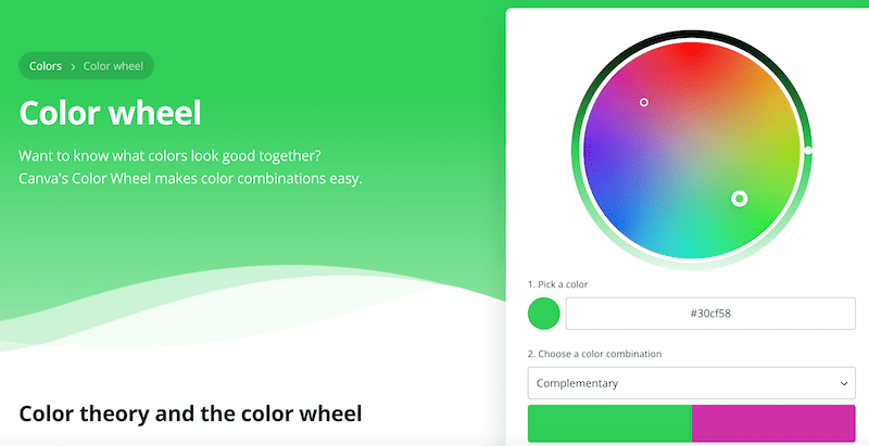
Want to know what colors look good together?

Canva’s Color Wheel makes color combinations easy.

Using the right colours together – will Boost Sales and Conversions.

Boost Sales and Conversions

How To Create a Killer Color Combination

If you don’t have a creative bone in your body and couldn’t coordinate a colour palette to save your life then don’t stress. There are tools and apps out there to help you.

Here are a few of my favourite places to find inspiration when I’m designing a new brand for a client:
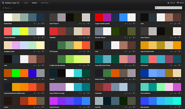
Adobe Color

Adobe Color

Previously known as Kulur, you can explore a library of cool user submitted colour combinations. Be warned, this can be a massive time suck because it’s just so much fun to browse.
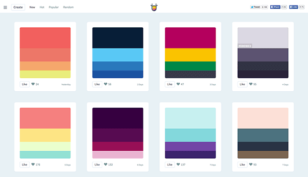
Color Hunt

Color Hunt

Similar to Adobe Color, but easier to use, color hunt features beautiful colour combinations each day and allows you to even submit your own.
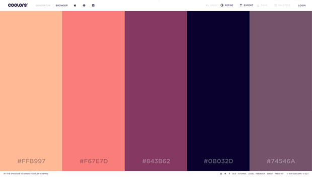
Coolers

Coolors

A super cool app for any budding colour enthusiast. Just hit the space bar to load up a new palette until you’ve found “the one”.

Coolers

Colors by HailPixel

This simple app is like an oversized colour picker that let’s you move your cursor across the screen to change the colour. Simple, beautiful and great for inspiration.

3. High-Converting Photography

We’ve come a long way since the days of cheesy, over-used, cringe-worthy stock photography.

You know the ones I’m talking about, a corporate team sitting around a boardroom table with big, perfect, teethy grins and picture-perfect formal business attire.

Thank the stars we’ve moved on.

Nonetheless, the right photography can be a powerful weapon for increasing conversions in just about any medium. Your Facebook ads, websites and landing pages can all benefit from a strategically placed photograph.

When choosing your photography you need to consider where you’re using it. If it’s for your main website ask yourself, does it support your brand or does it cause disparity?

If you’re choosing photos for Facebook ads or landing pages, try and use one where the subject faces towards your headlines or prominent copy. This has the ingrained pyschological effect of forcing your users’ eyes to where the subject is facing or looking and has been proven to increase conversions and engagement.

Just take a look at this Sunsilk ad for example:

Coolers

But how do you go about getting your stock photography? What website should you use? There are so many options out there and so many pros and cons of each that it can be a tad bit daunting in itself.

Let me try and unpack it all for you by recommending my favourite stock photo sites and the pros and cons of each.
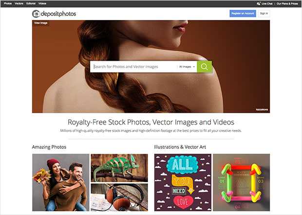
Deposit Photos

Deposit Photos

This is my goto stock photo site. Their range is massive and their quality is pretty good. It’ll take you a little longer to find the right image compared to the more expensive sites, but in my opinion it’s worth it.
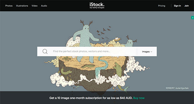
iStockPhoto

iStockPhoto

The grand daddy of stock photo sites. Their range is huge and their quality is impeccable. But expect to pay a premium for just one photo. A great option for agencies or those working with high-end clients and projects.
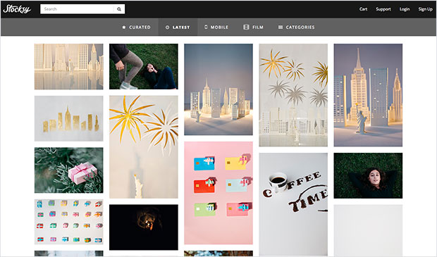
Stocksy

Stocksy

If I had to choose my favourite stock photo site based on quality alone, Stocksy would easily be my first choice. Their range is super modern and relatable. However their prices are still on the high end of the scale.

unSplash

Unsplash

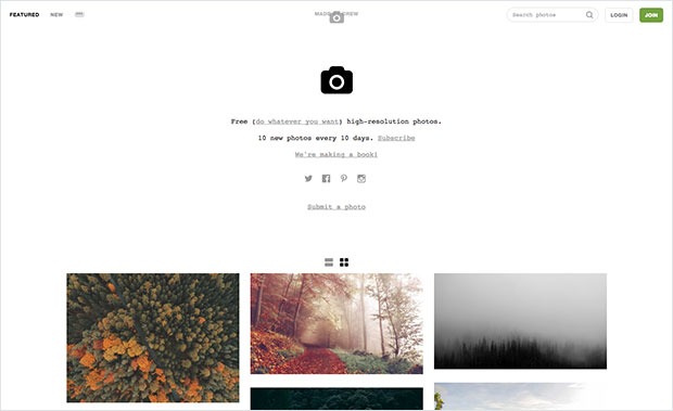
Perhaps you don’t have any cash to dish out on stock photos? No problem. Checkout unsplash for a beautiful range of free to use photography. The only problem I see with unsplash is their photos can be a bit impractical at times as they predominently feature landscapes and urban scenes, but I do believe this is starting to change.
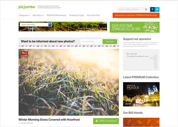
Pic Jumbo

Pic Jumbo

What? Another free stock photo site? Yes, yes indeed. Pic Jumbo has a great selection of practical free to use photography but their volume isn’t quite as big as unsplash’s.

When it comes to stock photography, again ask yourself, does it compliment my brand and is it strategically positioned to compliment any content or important copy features within the medium?

4. Your High Converting Home Page Layout

Chances are pretty high that you have a ‘hub’ website that acts as a central holding silo for all of your content and links to landing pages and squeeze pages. Chances are also pretty high that your website layout isn’t optimised to meet your business goals in the form of completed conversions.

Below is a wireframe of a conversion-focused home page layout. [A wireframe is an image or set of images which displays the functional elements of a website or page]

Website Wireframe

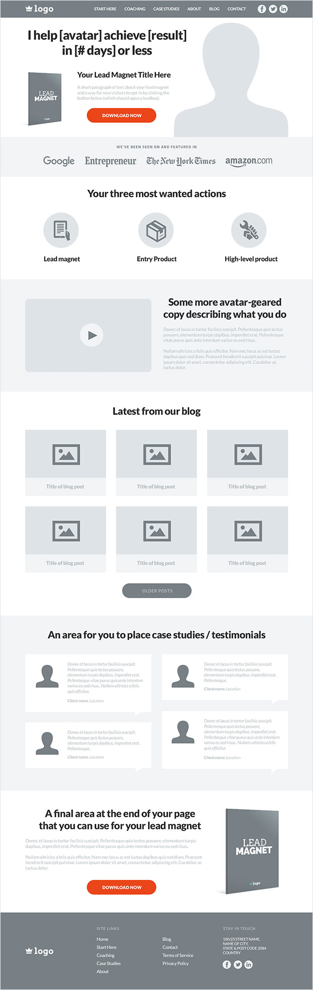
5. Website Navigation

A simple header with your logo and no more than 6 menu options and optional social icons works best. Don’t get tempted to use trends like the ‘hamburger’ menu on desktop sites – This will hurt your conversions and user experience.

Every website is different, but I’d recommend the following pages to include in your navigation.

Start here page:

If your website and blog is content heavy, you can use this page to introduce new visitors to your website and direct them to the most popular and relevant categories using a stylised, user friendly sitemap.

Alternatively, you can use this page as a squeeze page that provides a lead magnet related to their problem and your solution.

Products / Services Page:

Next item along in the navigation would be the perfect place to showcase your products or services page and link out to any external (or internal) landing pages you may have for each product or service. If you have multiple products and services, a drop-down menu would be ideal for this.

Case Studies / Testimonials / Portfolio Page:

Your customers and clients want to know your solution works right? Depending on your business, place a case studies, testimonials, results or portfolio page in your navigation menu to build trust with new visitors and show them that you actually deliver value.

About Page:

Yep, the infamous about page. This is your chance to talk about yourself, your company, your products, services and any awards and accolades you’ve achieved and is a must for your navigation menu as it builds trust and reduces friction.

Blog Page:

Almost any business can benefit from content marketing and doing so will result in long-term website traffic, and if done correctly, lead generation in the form of content upgrades, opt-in widgets and so forth. If you blog (which you should!), it’s a definite must for your navigation.

Contact Page:

An absolute no brainer, your contact us page should always be in your navigation. If it’s missing, expect trust and conversions to go missing too. Give your visitors multiple ways of contacting you. Think email, phone, Skype, business address, social media, homing pigeons… You get the idea.
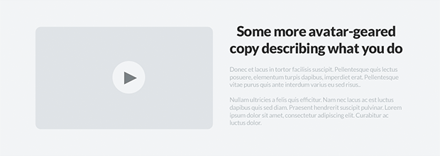
The Hero Area

Hero Area

Not to be confused with a full-sized homepage screen, your hero area should take up a large chunk of the fold and it should strategically make it entirely clear about what it is your business does, whilst acting as a vehicle to collect new leads via a lead magnet.

As you can see, the headline is short and sums up exactly what the business does. There’s a space for a professional image if this is for a personal brand website, or it can be replaced with any other image or even an intro video.

The next feature you will notice is the area for the lead magnet. The idea is to display an ecover of your lead magnet with a short headline, some supporting text and finally a button that when clicked will open a popup with your opt-in form. There are many tools out there that can do this such as Popup Domination.

The ‘Authority’ Bar

website-authority-bar

A common design feature you’ll notice on many websites owned and run by authority marketers is the ‘Authority Bar’. The purpose of this bar is to obviously build trust, authority and credibility. It’s there to say “Hey, I know what I’m talking about when it comes to [TOPIC] and I have the trust of these major publications and networks to back me.”

If you’ve been featured or guest blogged for any respectable website, blog, magazine, newspaper, or publication then this area is your chance to demonstrate your expertise.

The ‘Most Wanted Actions’ Box

website-mwa-bar

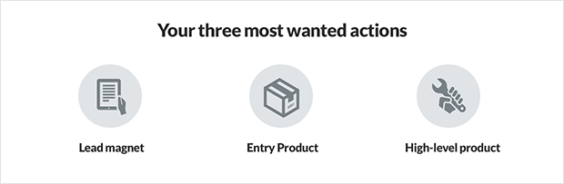
So by now you’ve made it clear about exactly what you do and the problem you solve, you’ve provided an opportunity for visitors to join your tribe and you’ve showcased your expertise with the authority bar.

Next step is to direct visitors to your Most Wanted Actions (MWA), in order of the easiest action to take, such as a lead magnet download, to the higher-level actions such as joining your high ticket coaching programs.

Each inner MWA box or icon should link out to it’s corresponding landing page or squeeze page that then takes over and encourages your visitor to take that particular action or conversion.

The ‘More Info’ Box

website-more-info-box

Some website visitors need nurturing before they trust you with access to their inbox or their hard earned money. The ‘More Info’ box is designed to provide further background about your business and the problem you solve for your avatars.

A good combination for this area would be to provide a video, sub headline and a paragraph or two of supporting copy to speak to your visitors and provide a more thorough insight into your business, products and services.

Blog Posts

website-blog-posts

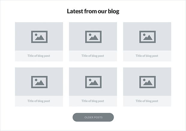
Again, if you’re using content marketing as a channel to reach your audience, it’s a no brainer to include your most recent blog posts somewhere on your home page. There are many ways to aesthetically present your blog posts and multiple layouts to choose.

My favourite however has to be the card-style grid layout. It provides a space for a feature graphic, a title and it allows visitors to quickly scan your blog posts to see which piece of content is most relevant to their immediate needs.

Testimonials and Short Case Studies

website-testimonials

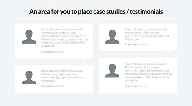
To back up your authority, influence and value you should consider adding an area to your homepage that includes 4 – 6 testimonials from some of your existing customers or clients. This will only contribute towards building more trust and demonstrate that the work and products you provide actually deliver results.

Bottom Lead Magnet Box

website-bottom-lead-magnet

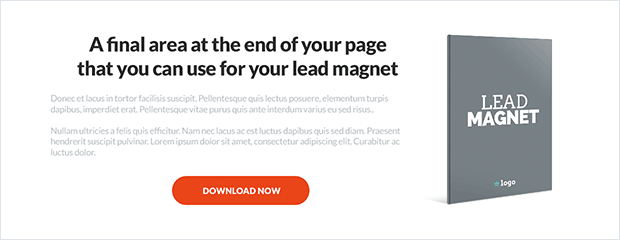
According to many heatmap studies, not many visitors will scroll down this far on your homepage. With the boxes and modules already listed above this area your visitors should be well on their way to exploring your products, services and content.

However, you still shouldn’t neglect this last effort to encourage visitors to join your tribe.

This bottom lead magnet area will help you do just that. Use this space to showcase your lead magnet, provide a headline and two or three paragraphs of supporting copy alongside a lead magnet cover graphic and call to action button that opens a popup opt-in form.

The Website Footer

website-footer

Ahh, what can I say? We all know what a footer is so it goes without saying that it should be the final box or area on your website.

As standard practice goes, adding your logo and relevant site links alongside SEO links, contact information and social media boxes and icons is the way to go when crafting your footer.

So that’s a typical high-converting home-page layout in a nutshell and it’s suitable for almost any kind of business model. If you take the time and investment in setting your website up this way, I can almost guarantee you’ll be seeing a huge increase in your bottomline within a few months time.

Keeping Design Consistent with a Style Guide

So far we’ve discussed typography, colour, photography and your high-converting home page layout. Once you’ve nailed down all of these creative elements you then need to put the effort in to keeping it all seamless and consistent.

That’s where your brand style guide comes into play.

A style guide is a document that explicitly states how your brand should be represented visually in terms of logomarks, typography and brand colour palettes.

If you’ve never used or adhered to a style guide before I’m sure you’re well aware of the degenerating process your website and other creative material take. The first month everything looks great, but 12 months in and your brand has taken on a Frankenstein appearance and nothing is consistent or matches up. It’s in shambles.

The way to avoid this is to create a simple brand style guide that lays out strict rules and criteria for your logo, colours and typography.

Below is an example of a simple style guide template.

style-guide-template

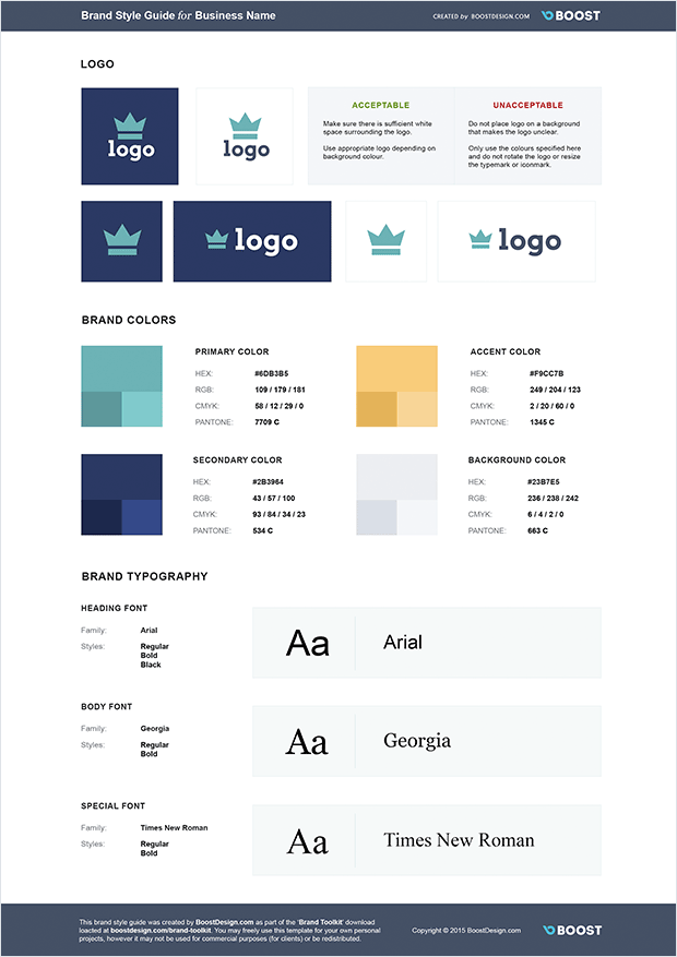
In your style guide you should include all of the different logo variations you use, including inverted logos and black and white logos, along with up to 5 brand colours (and their shades) and the fonts you’ve chosen to use in your branding.

Once you have your style guide built out, don’t let it sit on your hard drive to collect cyber dust. Instead, whenever you hire a new employee or contractor who are tasked with any creative work, make sure your style guide is the first thing they see.

When you, your employees and contractors work with your style guide your brand is guaranteed to stay consistent, seamless and beautiful for many years to come.

I sincerely hope you’ve enjoyed reading this post and that you’ll implement one, two or all of these design features into your own business and websites. If you do, I can guarantee you’ll only see positive results.

And remember, when your business reaches a certain level you should definitely consider hiring a pro designer to help you with all of this. I’m currently available for design work myself so please feel free to checkout my AwesomeWeb profile and reach out with any questions you have.


18 Things Making Your Website Slow 2021

18 Things Making Your Website Slow 2021


Optimizing the loading time of your website is a win-win approach to keep the visitors of your site happy and to increase the revenues generated by your online business.

To shed light on all those issues that slow down your website, we invited Stavros Papadakis to lay out his process for speeding up slow websites.

What Makes Your Website Slow?

You should definitely check my previous post with 16 ways to speed up your WordPress website.

Although this post provided a quick checklist with the best tweaks to optimize the loading time of your WordPress website, there are still many issues that can slow down your website.

If you have enabled compression on your htaccess file, combined CSS files, moved Javascript files to the footer but you are still not happy with the loading time of your site, then check these 18 common issues that slow down your website.

1. Super-heavy websites

There is no doubt that a 3MB page making 180 HTTP requests is going to be slower than a 1MB site with 60 HTTP requests.

Do you want to optimize the loading time of your site?

One of the best ways to do that is by minimizing the size of each page of your site.

Although you can optimize your images, combine CSS files, minify Javascript files and apply many front-end optimization tweaks, having a 3MB site is going to make your site slow and the users of your site unhappy.

21MBs are a huge load for both the server and the browser.

21MBs are a huge load for your server and your browser.

While you are designing or redesigning your site, you should do your best to load only what you need and nothing more.

In others words, you should always ask yourself:

Do I really need 8 big images at my slideshow at homepage?

Do I have to display 20 portfolio items at homepage?

Should I show 12 testimonials of happy users at homepage or 3 testimonials will do the trick as well?

Loading all these data makes your site look nice but your site will be slower as well due to all these data.

Do you want to have a slow loading site? If not, then minimize the data loaded per page of your website.

2. Non-optimized images

Do you know that 80% of the time that it takes to load a website is controlled by the front-end structure?

This is an amazing fact of web performance optimization.

80% of the end-user response time is spent on the front-end. Focus on that.

80% of the end-user response time is spent on the front-end. Focus on that.

You can try to optimize your database or PHP code but if you ignore this fact of paramount importance, then your website will be slow.

A 460KB PNG file can become 90KB by optimizing it.

If you have 10 non-optimized images at your site, then you may add 2-3 MBs of extra page load.

If you do not optimize your images, then the loading time of your site can be severely affected.

The good news is that most of the JPG and PNG images can become 40% or even up to 80% smaller without losing image quality by optimizing them using Photoshop, ImageOptim or a third-party tool such as Kraken.

3. Excessive usage of ads

Google Adsense and other similar services can be an extra source of income for you but they can also slow down your site.

A website that loads ads in header, to the right sidebar, in the body of the post and at the bottom of the page using 2 or 3 different ad services, is going to be much slower than a website with only 1 ad in the right sidebar or in the body of the post.

Not only are the ads annoying for most of the users but they will slow down your site as well.

Please check the following screenshot from a client’s website.

Do you really need all those annoying ads?

Do you really need all these annoying ads?

Believe it or not, there are 4 different ads in it, one ad at the top of the screenshot, the video which is an ad, an ad to the right sidebar and another ad at the bottom of the page! Needless to say, those ads are annoying for most of the users and slow down the loading time of your site as well.

To sum it up, ads should always be used with caution. As long as an ad does not generate money, it should be removed.

4. Wrong dimensions for your images

You should not scale images in HTML, you should resize a large image and use the resized image instead.

For instance, let’s assume that you have an image that it is 1200px x 600px and you want to use a “smaller” version of it e.g. 400px x 200px.

In that case, do not use the original image and scale it down by changing width and height dimensions in HTML.

You must create a new thumbnail image by resizing the original image from 1200px x 600px to 400px x 200px and use the new image which is smaller and will load faster.

I have come across many sites that used to load a 256 x 256 facebook image of 150KB instead of a 32 x 32 facebook icon of 2KB!

5. Pointless redirects

I have one quick quiz for you.

Which one of the following images loads faster, A, B, C or D?

A. http://www.domain.com/image.jpg
B. http://domain.com/image.jpg
C. https://www.domain.com/image.jpg
D. https://domain.com/image.jpg

Did you choose A? Wrong.
Did you choose B? Wrong.
Did you choose C? Wrong.
Did you choose D? Wrong again!

The right answer is that it depends on your site!

If your site is https://www.domain.com, then by calling the non-HTTPS version of the image (http://www.domain.com/image.jpg), there will be an extra redirect from http://www.domain.com/image.jpg to https://www.domain.com/image.jpg by the browser in order to load the image.

If you are using the non-www version for your site (http://domain.com/), then you should always use the non-www version for your images as well (e.g. http://domain.com/image.jpg instead of http://www.domain.com/image.jpg).

Browsers do not like this kind of pointless redirects.

Pointless redirects will slow down your site

Pointless redirects will slow down your site

By using relative URLs for your files (e.g. <img src=”/image.jpg” />), you can easily get rid of this common issue that slows down the loading time of your site.

6. Wrong server location

If the traffic of your site is mainly from USA or UK, then your site should be hosted by a hosting company located in USA or UK respectively.

The closer the server is to the visitors of your site, the faster your website will be.

Needless to say, if you get traffic from all over the world, then I highly recommend you to use a Content Delivery Network or CloudFlare so that images, CSS and Javascript files are loaded from a server closer to each user’s location.

7. Dodgy shared hosting plans

No one wants to pay $$$ for hosting a site but serving a WooCommerce site with 40 active plugins or a Magento site with 5000 products via a shared hosting plan that costs $5 per month is a recipe for disaster.

You should always invest in a good hosting company to get the best loading time for your site.

If your site is unavailable or slow, then you may save a few dollars per month by using a shared hosting plan but you will lose much more by losing your clients (a user that visits a slow loading site will not revisit this site).

If you have a heavy WordPress site using Woocommerce or many active plugins, then I highly recommend WP Engine and FlyWheel (affiliate links).

You should not expect to get 200.000 unique visits per month to upgrade to a VPS, this will never happen while you are hosting your site on the same overloaded server with hundreds of sites on it.

8. Excessive usage of social media scripts

Social media (Facebook, Twitter, Pinterest etc) scripts add a DNS lookup, a set of Javascript files and a few images as well whenever they are added in a page.

Although many of those sharing options should be available at the end of your posts so that your users can easily share your posts, it does not make sense to load all those sharing options at every single page.

What’s the point of loading those social media icons in every single page e.g. at the contact page or at your category pages?

Showing 5 different social media counts for each post on homepage or category pages adds a lot of load to your site. How important is it to show counts on these pages? Do you need to show Facebook, Twitter, Pinterest, Google Plus and LinkedIn as well?

Too many social media scripts can kill the performance of your site

Too many social media scripts can kill the performance of your site

Would you be best of just showing 1 or 2 that perform well for you? If you don’t get many shares, is there much point showing any at all?

You should always think twice before adding any social media options in a page of your site.

9. Wrong file type for your images

If you need transparency for your images then you cannot avoid the PNG file type BUT if you do not need transparency, you should never save your images as PNG files because they are much bigger in filesize so much slower than JPG images.

Minimize or even eliminate any heavy GIF files because they can drastically slow down the loading time of your site.

You should also try to avoid saving images with text as content because it can be a time-consuming process to edit the text on images and generated images are much heavier as well.

Use JPG as your default. It’s the smallest and fastest loading file type for most of the files.

10. Not taking advantage of dedicated services

There is a big number of popular services that can reduce the load of your server.

Do you have videos on your site? You should use YoutubeWistia or Vimeo.

Do you have many comments on your site? You should use DisqusIntenseDebate or

Do you use jQuery, jQuery UI, AngularJS or Mootools? You should load them via the Google hosted libraries.

Do you use WordPress and display popular posts? You should use Jetpack which does that automatically for you.

You can also use a Content Delivery Network (CDN) to serve your images from it instead of your site.

If your site is getting significant traffic and you load many images and videos, the loading time of your site can be optimized drastically by balancing your site’s workload with the above-mentioned tricks.

11. 404 errors

If you try to load a file which does not exist or the browser cannot find then the loading time of your site will be affected by this 404 HTTP error.

You should always check for any 404 errors during the rendering of your pages in order to achieve the fastest loading time. You can do that either by checking the generated waterfall of your site using Webpagetest and GTMetrix or by using the network tab of browsers such as Chrome and Firefox.

If Webpagetest shows any red lines on the waterfall then you should immediately troubleshoot and fix those 404 errors.

404 Errors Can Ruin Loading Time

404 Errors Can Ruin Loading Time

This kind of errors can really ruin the loading time of your website especially if you serve your site via a shared hosting plan.

12. Not caching your site

Every content management systems (WordPress, Joomla, Drupal, Magento) uses a database in order to save a big set of data on it.

Although this is great for managing your site, it also means that it adds extra load on your server in order to generate each page every time it is requested.

You can solve this problem by using caching.

If you use WordPress, then you can either use a caching plugin such as
W3 Total Cache or WP Super Cache or ZenCache or use a managed server hosting company such as WP Engine and FlyWheel (affiliate links) which take care of caching.

Needless to say, Joomla, Drupal and Magento offer caching options as well which can help a lot by providing cached versions of your site for consequent site visitors instead of generating each page over and over again.

Caching your pages can drastically speed up your site

Caching your pages can drastically speed up your site

Caching is a no-brainer for any database-driven website. Even a 10-minute caching period can optimize the loading time of your website drastically.

13. Hundreds of HTTP requests

Every CSS file, Javascript file or image loaded on your site is a HTTP request. The more HTTP requests your site has, the slower your site will be.

Although you can try to combine CSS and Javascript files, to inline CSS files and to use CSS sprites for small images, if you implement those tweaks and you still have 150 HTTP requests, then you should obviously try to declutter your site by removing content from it.

246 HTTP requests will slow down your site no matter how optimized it is

246 HTTP requests will slow down your site no matter how optimized it is

I know it is tempting to display a lot of content in each page of your site but please keep in mind that “less is more” so try not to load so many images or scripts.

14. Bad server configuration

If you are on a shared hosting plan, it is quite common that they do their best to serve as many sites per server as possible.

They usually do that by disabling features such as compression and KeepAlive among others.

Enabling HTTP Keep-Alive allows the same TCP connection to send and receive multiple HTTP requests, thus reducing the latency for subsequent requests.

Compression reduces the size of files sent from your server to increase the speed to which they are transferred to the browser.

If you are on a shared hosting plan and your hosting company has disabled compression and Keep-Alive, then you should switch hosting company as soon as possible.

Keep-Alive and compression should be enabled on your server

Keep-Alive and compression should be enabled on your server

15. CSS imports

CSS imports are a nice way to import CSS files on the top of a new CSS file e.g. importing a CSS reset file but it adds additional delays during the loading of a web page as well.

You should avoid CSS imports, whenever possible.

16. Loading unnecessary files on each page

You should load CSS and Javascript files only when they are required on a page of your site.

For instance, if a specific Javascript file is needed only on a single page, in that case, you should load that Javascript file only at this URL instead of loading it on every single page of your site.

If you do not follow this simple rule, then you can end up loading 30 CSS and 40 Javascript files on a page which needs only 3 CSS and 4 Javascript files so you are making 63 extra HTTP requests and adding many hundreds of kilobytes on the page size.

17. Loading heavy files on the background

Many sites used to load big background images which are hardly visible.

Do you really need a 500KB image loaded on the background? You should try to use CSS3, whenever feasible or use a background color instead.

It is also a bad practice to load sound files on the background while your site is loading.

Most of those techniques are slowing down your site and should be avoided.

18. Not using an expert

My goal was to give you enough information to get started fixing the slow loading pages of your site.

Optimizing the loading time of your site is a win-win situation for you and everybody who visits your website. Faster sites means higher conversions, better search engine rankings and a more enjoyable user experience.

It’s best to hire an expert when you want a job done well.

Amateurs can follow best practices but do not know where to begin.

An expert will fix the actual problems that slow down your site.

Whenever an amateur does not know the real problems of your website, they will recommend a pointless temporary solution such as moving hosts, changing theme, installing a different caching plugin or even switching CMS.

Many of my clients have wasted their time and money on amateurs who had just installed a caching plugin without fixing the actual problems of their site.

You should always keep in mind that each website is unique so different speed optimization tweaks have to be applied per site.

To sum it up, optimizing the loading time of your site should always be done by an expert who will perform the speed optimization tweaks with surgical precision.

Imagine how happy your users will be to see super fast loading times!


11 Essential Lessons From Going Into Business With People 2021

11 Essential Lessons From Going Into Business With People 2021


Over the past four years, I have started 7 different businesses with fellow entrepreneurs.

All these businesses and ‘partnerships’ brought me new lessons and today’s post reflects on the Big Lessons these business journeys have provided.

But first some distinctions:
Partnership: A business owned and run by two or more partners.
Joint venture: It is temporary in nature and is terminated as soon as the venture is completed.
Shareholders: An owner of shares in a company – usually a limited company and shareholdings need not be equal.

Selecting a Business Partner Wisely

business partners

Business Partnerships are not unlike marriages – the separation (the divorce) can be very painful. So just like choosing a life partner, choose your business partners carefully.

I am regularly amazed at just how casually people end up in business together.

Most people would not marry someone without some serious getting to know them time. Yet, I find people who have barely met going into business with each other – especially in today’s digital marketplace.

Is your potential partner a positive happy person? How do they react under pressure? Are they the kind of person who is vengeful and vindictive? Beware of anyone who boasts about getting ‘one over’ in a previous business dealing – because chances are one day it will be you that they will want to get ‘one over’.

OK they may have a skill or money that the business needs but if you can’t get on or respect each other it is going to be challenging for both of you.

Before reading this list I should say this is not Legal Advice – it is some key lessons from a personal perspective – hire and pay a professional for advice.

Additionally one thing I see a lot of is individuals referring to each other as partners – when no legal partnership agreement exists. Beware of this term – in some parts of the world if a true partnership exists you could be responsible for the debts of your partner.

OK, on to the main points:

1) 50% of something big, is better than 100% of nothing

You could argue that none of the businesses I created with partners would have ever happened, if I didn’t give up some ownership share and control.

2) It’s less stressful when you share responsibility.

This is especially good if say one of you is the writer / creative type and the other is say more technical.

3) Most people will choose what they want to do, not what is best.

This is a BIG one – all growing businesses have challenges – the road to the top is not a straight up arrow and there will be things that don’t go as planned. It is in those times that people often retreat into their comfort zone and do the things they like doing rather than the things that need doing. They fail to prioritize and if you don’t watch out the business will fail.

As Drew Houston (the founder of Dropbox) says:

“It’s OK to have growing pains, as long as you’re prioritizing correctly and working to address them. Every company looks messy from the inside,”

4) Greed at some point usually takes over.

Strangely the more successful the business is the more reluctant some partners can be to share. This is why it is essential everyone knows their roles / responsibilities. For example in some ‘deals’ one individual may have the idea and put up the cash and thereafter have very little ‘work’ involvement while the other partner would on the surface appear to be working harder and sooner or later may forget it was the other partner who put up the cash / had the idea. As I say. it is essential to have an agreement on different roles clear and out in the open from the start.

5) Sometimes you have to admit defeat.

Give it your best shot – know in your heart you did your best but if for whatever reason it is not working out sometimes it best to cut your loses and move on.

6) Don’t rush to make any decisions.

But on the other hand don’t take days and weeks over something – but in my experience ‘sleeping on it’ (taking 24hrs) over a major decision can often be the wisest choice. Whatever you do – don’t make big decisions when feeling angry.

7. Everything needs to be in writing

All the important stuff needs to be in writing – make it a habit to record all major discussions and outcomes of discussions. Should there be a misunderstanding later – you can always refer back.

8) Open communication is paramount.

I can’t help my business partners solve problems if they don’t tell me about them. I can forgive people messing up, what is not acceptable, is hiding from it. Tell your business partner everything.

As Marcus Lemonis, – the “business turnaround king” and star of CNBC’s prime time reality series The Profit is quoted:

“If you guys can’t communicate as business partners, you can’t be in business together. If you can’t tell him what’s wrong, then you shouldn’t be in business together”

9) Take responsibility

I am responsible. Sure… other people may cause problems, but I was the one who put myself in that situation.

10) Communicate on the phone and in person.

I hardly ever get anything achieved over email. You often end up playing email tag, resolving things slowly, waiting for replies. (But of course once something has been decided – confirm in writing / email)

One person I use to be in business with, would often ‘forget’ what he agreed to. Every time he ended up owing me money, he would make it a point that I had to prove that we ever had an agreement. Everything we ever did was done on a handshake, which admittedly was a silly thing to do, but I get excited about my ideas and just want to push forward with them quickly. Hopefully I’m done making this mistake.

What amused me about this example is, everything was in my name, the domain, hosting, merchant and so on. He only ever had a problem with our verbal agreements when he had any control over what we were doing. See number 4.

I never had a problem with anyone when business is conducted face to face. It’s when you allow them to hide away, they see the opportunity to be dishonest.

11. Crazy people can be hard to spot.

People will tell you what they think you want to hear. They will paint the picture that they are happy, smart, sane and willing to work there ass off. Never go into business with mean people. Never go into business with people who must always be right!

In conclusion – it is important to be realistic in all business relationships. Of course with good due diligence you minimize the chances of failure – but sometimes it just doesn’t work out.

Our ability to handle failure and move on / start again is ultimately one of the most important success traits for an Entrepreneur.

I should also say Thank You to all my business partnerships – even the ones that didn’t work out. We are always learning..

And finally a great quote from John D. Rockefeller:

A friendship founded on business is a good deal better than a business founded on friendship.