How to Create a Killer Offer That Converts Like Crazy! 2021
Copywriting Secrets Of The Pros!
Three times a year, in Miami, San Diego, and Nashville, Bedros Keuilian and I hold Mastermind Meetings.
Each meeting brings together forty online business owners to learn our latest secrets, hear from guest experts, and network with like-minded ambitious achievers.
It’s their chance to Play Up a Level and escape the isolation that comes with being a successful online business owner.
On the big day of the meetings, I line ‘em up, and Bedros knocks ‘em down 
What I mean is that I pump up the group with mindset and motivation, and then Bedros teaches them the killer copy and sales converting tactics our members need to go and make their first sales (for our beginners) or their first 6-figure launches (for the advanced members of our group).
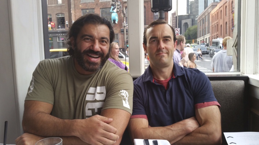
Bedros Keuilian, Craig Ballantyne, and the Nashville strip in the background
At the Nashville event in September, Bedros outlined the critical factors in creating a Killer Offer.
The Killer Offer Formula
StorySell – The Hero’s Journey formula
Bedros also taught us how to StorySell using the classic Hero’s Journey formula. It’s in every movie that you see and novel you read. “People resonate and learn from stories much better than facts and figures,”
Bedros said, “And the process, which I’ve outlined below, can be used in your email case studies, Facebook posts, used in live group or one on one selling and even built into sales copy, too.”
From Bedros:
The reader instinctively inserts himself into the story as the ‘hero’ and takes the journey in your story. Of course, where it’s most powerful is that in your storey the hero gets or achieves the reward… in real life, the reader is left without the reward and therefore must take action on your offer to complete the journey and achieve the reward.
This is why story selling is so powerful… it works on a deeper, more subconscious level forcing your reader to commit to and resonate with the hero’s journey. And that dramatically increases the odds of the reader, listener, viewer taking the desired action that you want them to take. It also creates a deeper bond with you, the storyteller which is how you become the expert and authority.
SO WHAT’S THE FORMULA TO TELLING STORIES LIKE THIS?
The Hero’s Journey…
Here’s an example...
I met one of our new Mastermind members, young Kenny Preslar, several years ago.
He went through some tough times but recently had a huge breakthrough.
Here’s his story and you’ll see that it follows the hero’s journey.
Boom!
It’s that simple. Stories don’t always have to belong… they can be short and punchy so long as they follow the formula above and pull the reader into the hero’s journey.
More Copywriting Secrets!
1) Create a Copywriting Swipe File
A swipe file can literally be a file folder where you print off great web copy or where you rip out pages from magazines.
Your swipe file should contain all of the best headlines, offers, and ads you’ve read so that you can refer to it when you are writing your own ads.
NOTE: A swipe file is NOT a “STEAL” file. You can’t plagiarize other people’s copy, BUT you can get inspiration from it.
(I keep a swipe file on my computer of the best emails and subject lines I get from email marketers.)
Go to Google and type in “100 Greatest Headlines Ever Written” and you’ll find a great resource to get you started. Two famous headlines of note include: “The Real Secret to Making People Like You” AND “Advice to wives whose husbands don’t save money — by a wife”. Can you think about why they may work?
Copywriter friend Robert Phillips also suggests keeping a swipe file of metaphors. A metaphor allows you to explain complicated concepts quickly.
The example Robert gave me was from a health ad touting an antioxidant pill. To help readers understand the benefits of an antioxidant, the writers compared oxidation inside the body to what happens when your car rusts.
The reader will immediately think, “A-ha! I know what my car looks like when it rusts…and I don’t want that happening inside my body…so I need this pill.”
Metaphors are powerful, and you can find them in almost every piece of copy. Keep your eyes out for good ones to add to your swipe file.
2) The #1 mistake people make is not…
…asking for the sale.
Robert says he reviews a LOT of copy, and most people write a decent headline and make a great offer, but then really “wimp out” when it comes time to ask for the sale.
So make sure to keep a swipe file of the best closes, to see how the masters get their prospects to take action.
3) A good product with average copy plus a great list plus GREAT DESIGN = Success
Two things that can boost the success of “average” copy are:
a) Sending it to the right list
b) Adding Great Design – AKA “cosmetics” to the copy/message.
When you send a great copy to people who aren’t interested, you won’t make many, if any sales. But if you send an “okay” copy to a hungry marketplace, you’ll make a LOT of sales.
This is called having the right “message to market match”.
Of course, if you have a fantastic copy and a killer offer then the success you can expect will be greatly multiplied!
And it’s a very important mindset to have when building your list and creating offers for that list.
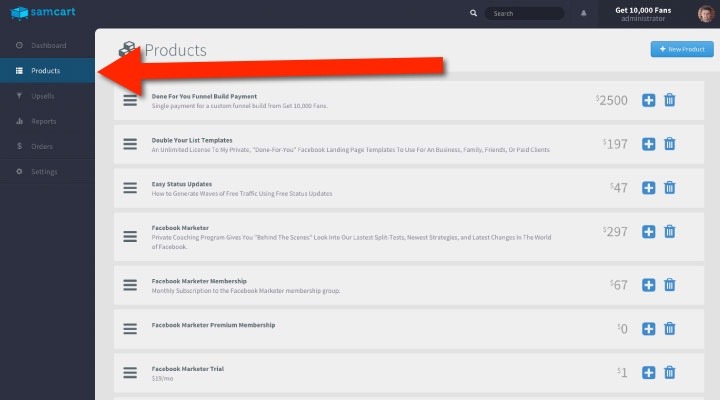
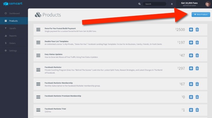
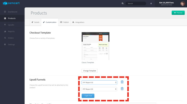
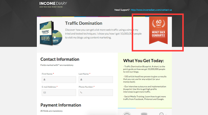
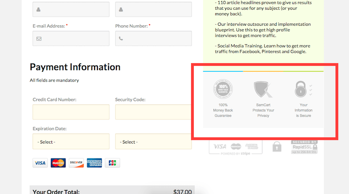
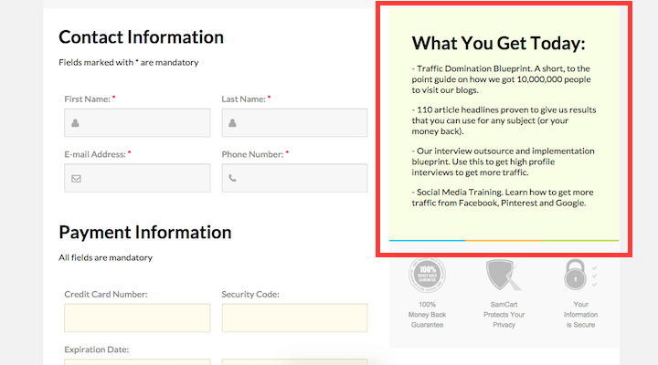
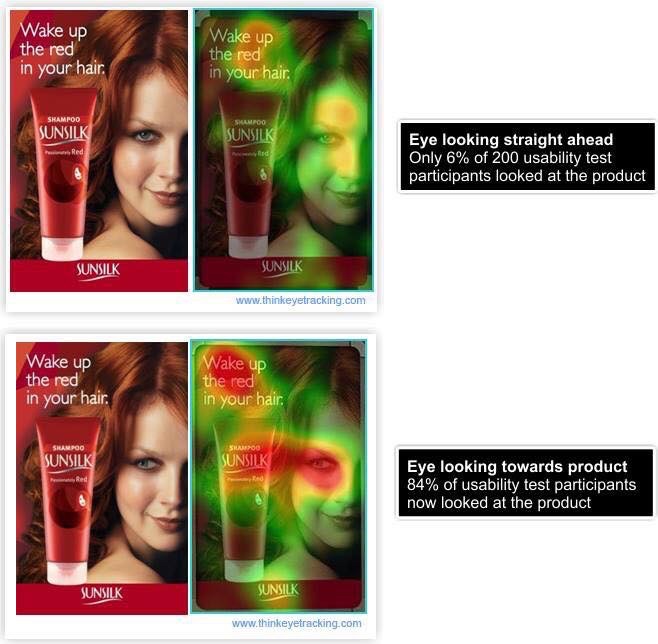
Great Design (cosmetics) can include adding photos, sub-headlines, different fonts, bolding text, plus using images like red arrows and yellow highlighting to point out the key parts of the copy that your prospects must-read.
Now, beware, overdoing any particular ‘design’ feature – like too much BOLD of highlighting is not a good thing, That is why we say Great Design and you will find some great examples here.
Finally – for some more inspiration, (and adding to your Swipe File) Check out 10 10 Reasons Why You Suck at Email Marketing this helps you become a better writer and storyteller.
Copywriting Bonus Tips!
Four Reasons Why Your Sales Page Is Not Converting…
How to Improve Weak Headlines
A final thought from Zig Ziglar:
“If people like you they’ll listen to you, but if they trust you they’ll do business with you”